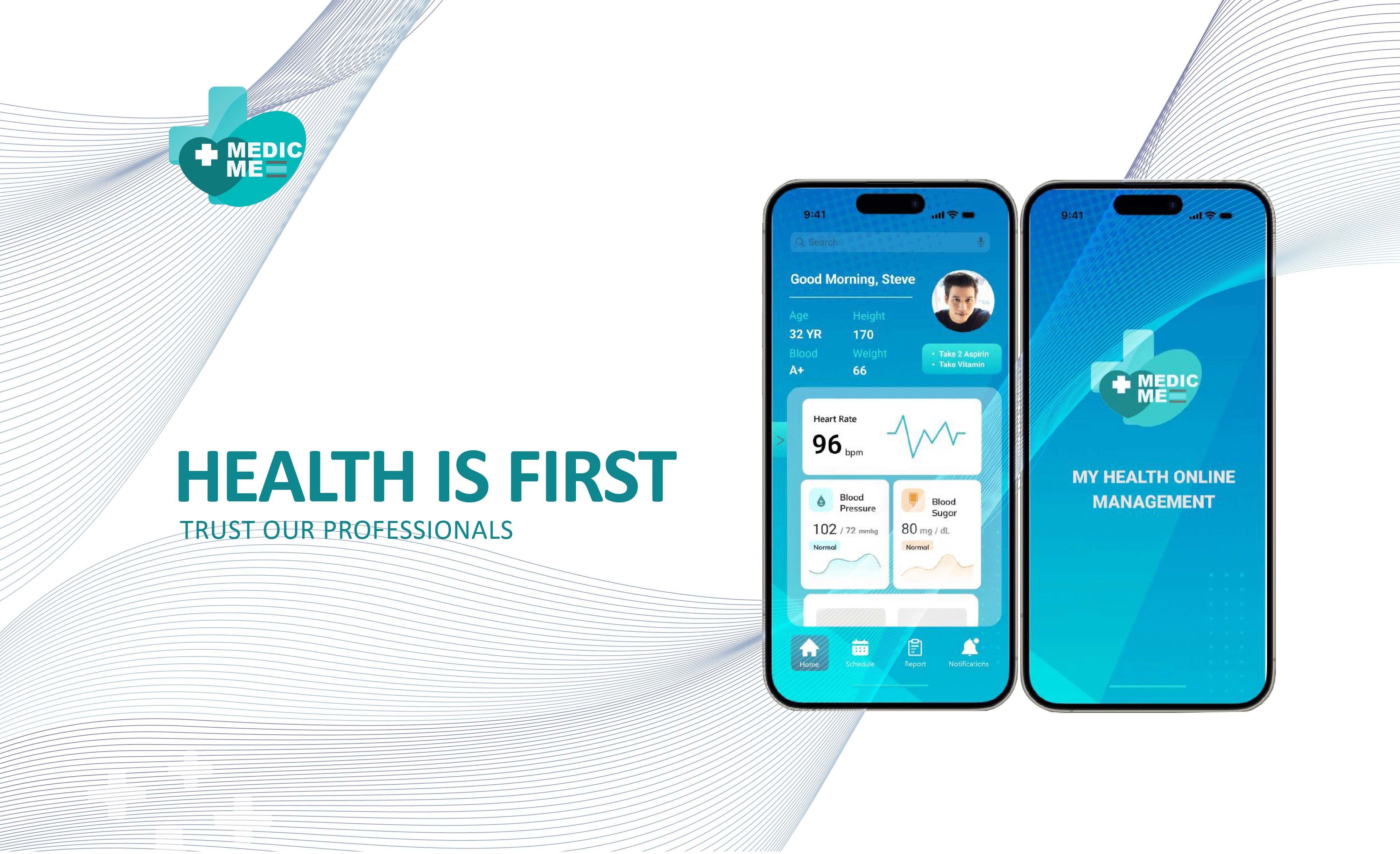
This case study describes a health application that focuses on health practices that are useful for individuals and the surrounding community. The project includes the development of a new brand identity, website, and digital marketing strategy for addressing healthcare solutions that can be accessed anytime and anywhere.
Project Type
End to End Application
Role
Solo Product Designer; Research and Development; Brand Design; Ui/UX Design; Prototype Testing
Tools
Figma, Miro, Framer, Photoshop, Illustrator, Office 365, OBS Studio
Introduction
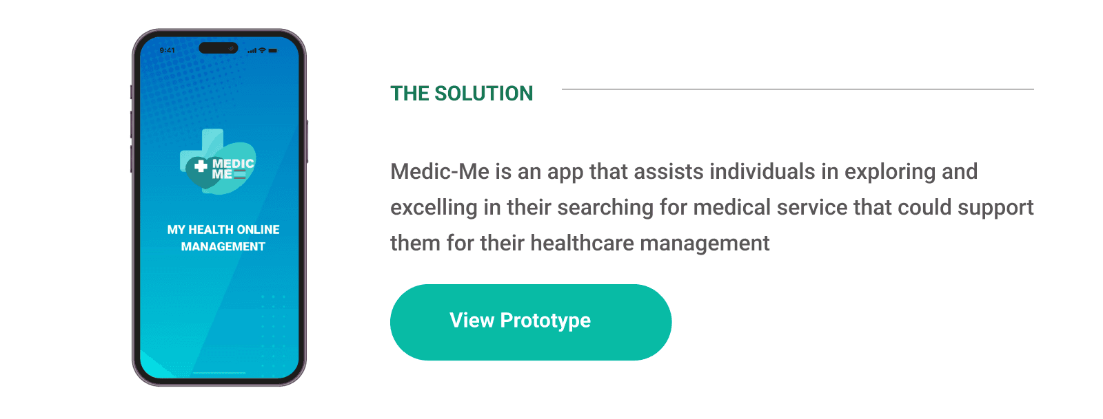
“Helping people in the US fulfill their health needs and health management settings that each individual can manage in all situations and anywhere.”
Background
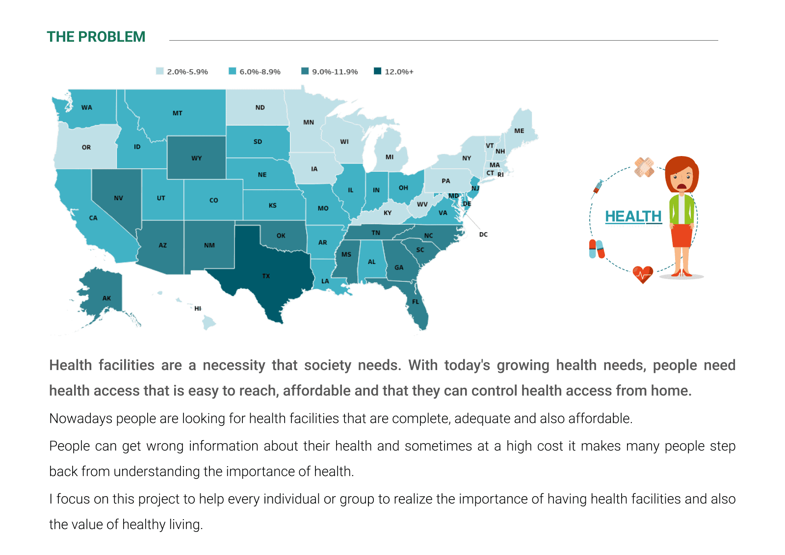
Health facilities are a necessity that society needs. With today's growing health needs, people need health access that is easy to reach, affordable, and that they can control health access from home. The application here is a method for easily accessing health, to improve the quality of life of individuals and groups.

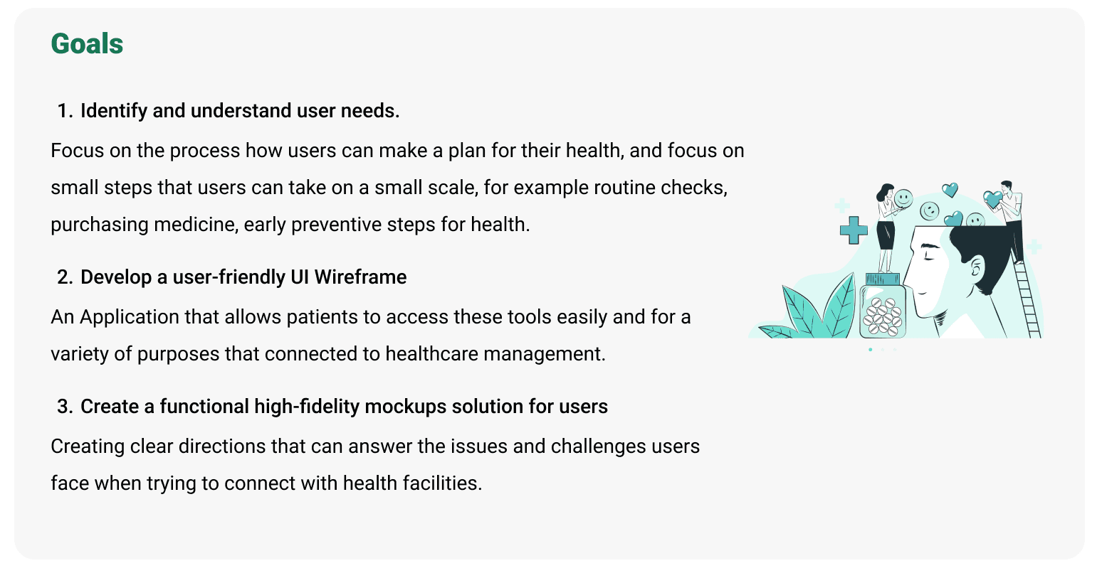

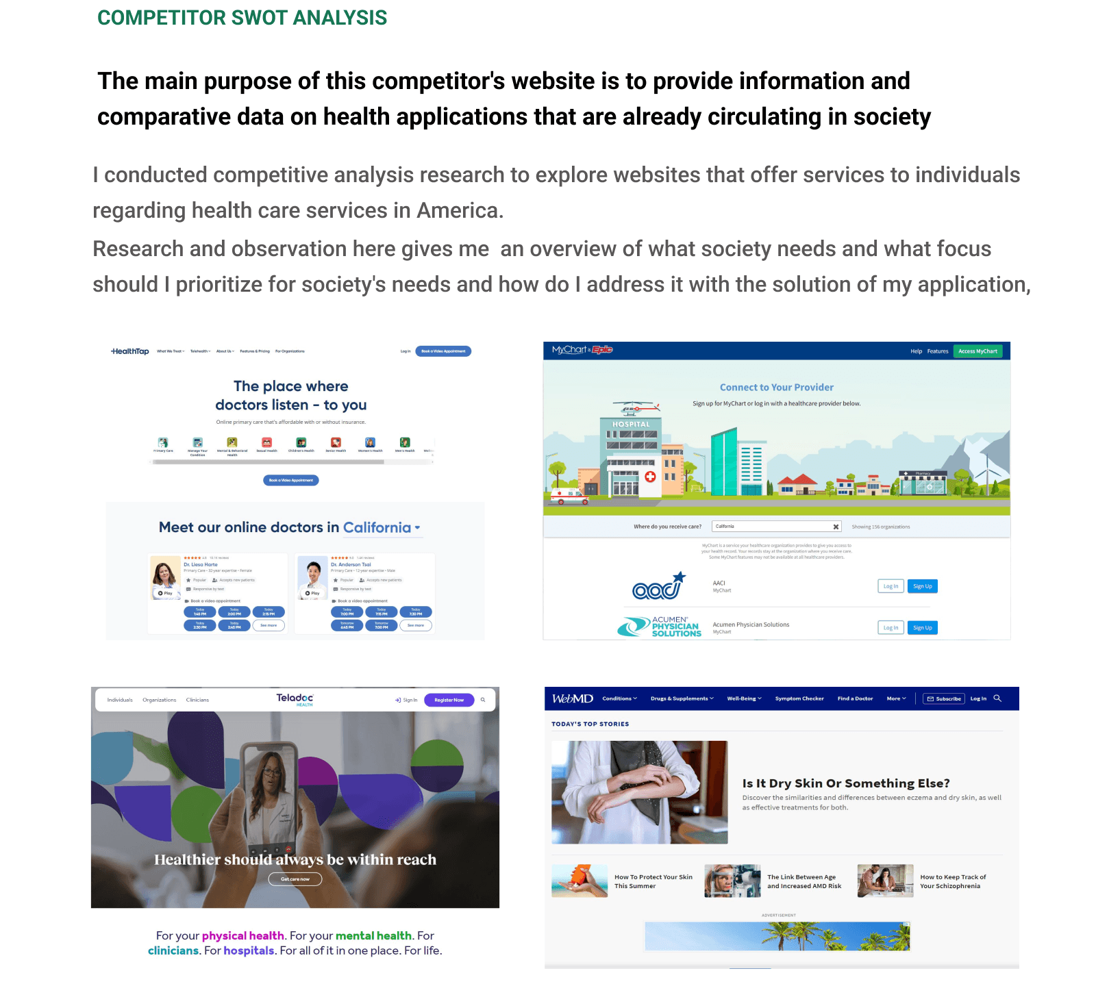
Analyzing Research Data
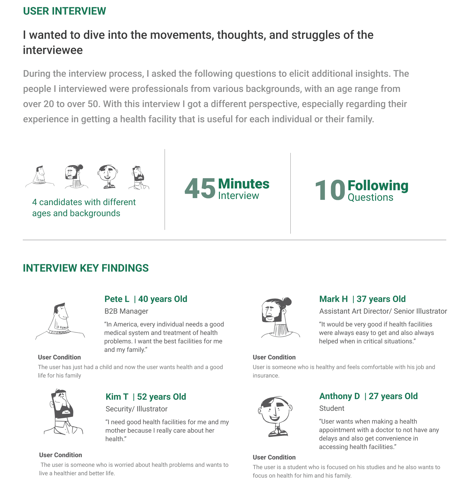
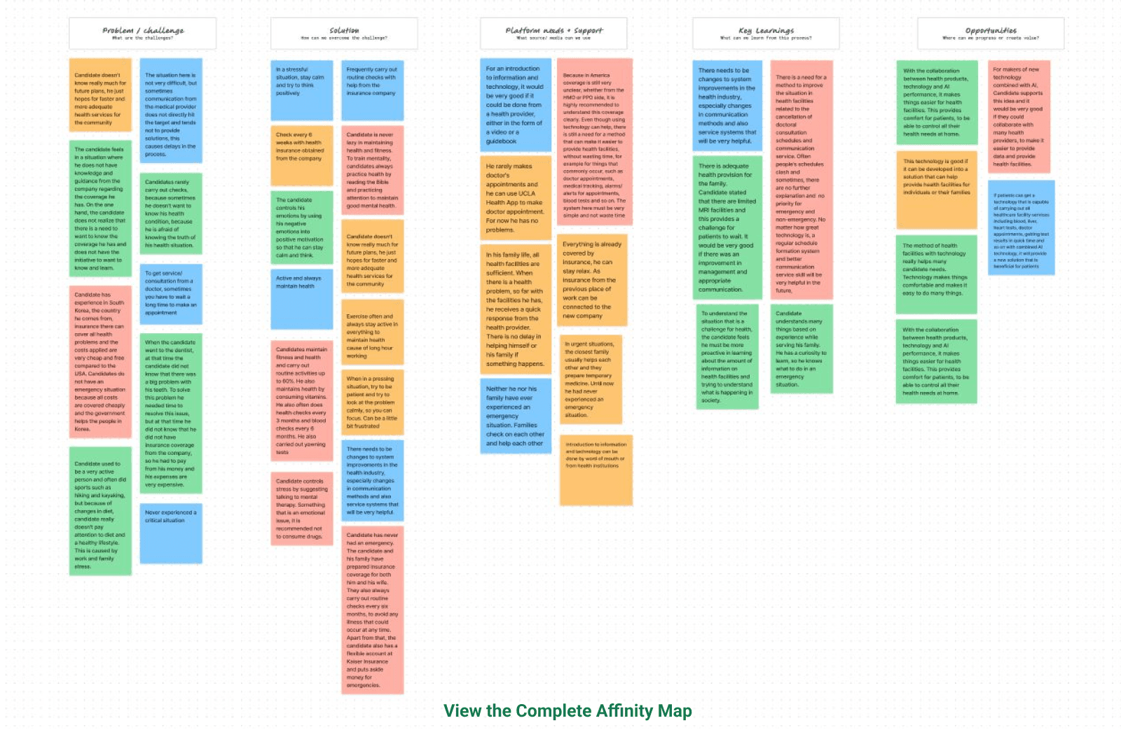
Affinity Mapping
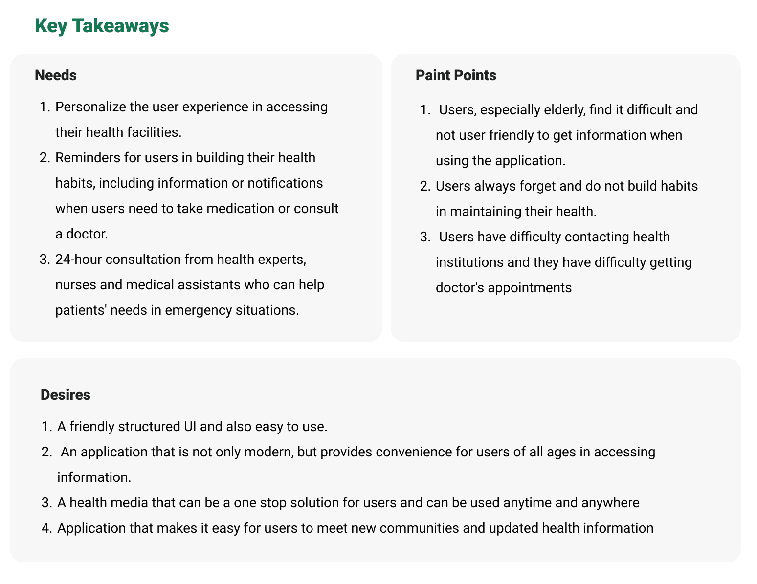
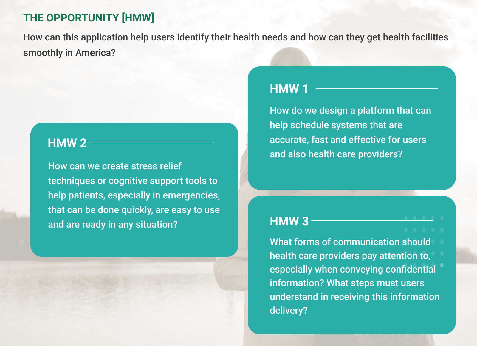
Meets the users: User Personas and User Journey Map
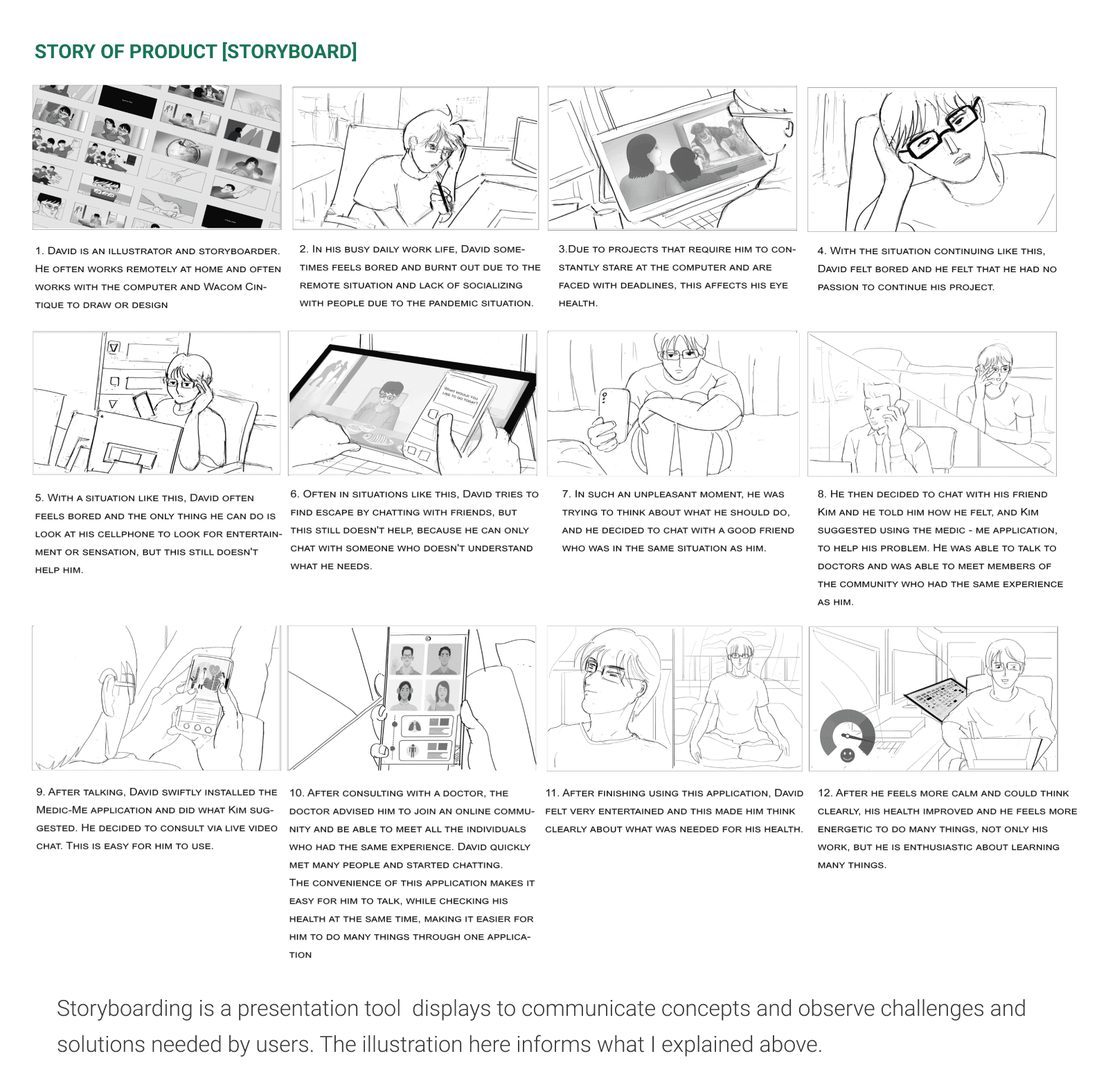
Using information and opinions expressed through surveys, interviews, and related research, I developed two personas for my 2 candidates: Kim, a professional working as a Security and Illustrator, and Mark, a professional working in the Motion Picture Industry as an Art Assistant Director and Senior Illustrator. They provide information and whatever the candidates need as well as all their complaints related to the development of this application.
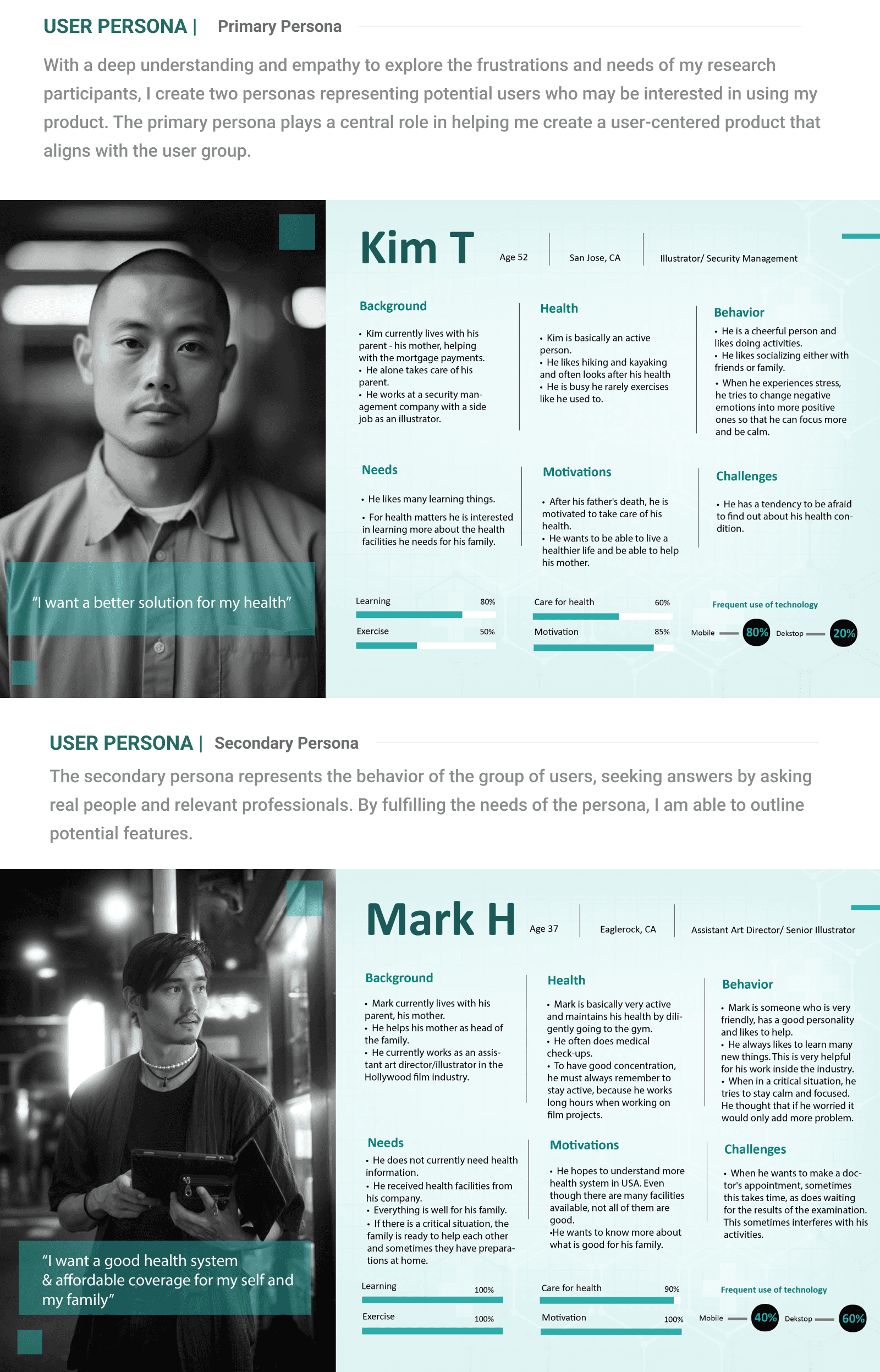
What I learned from the Personas
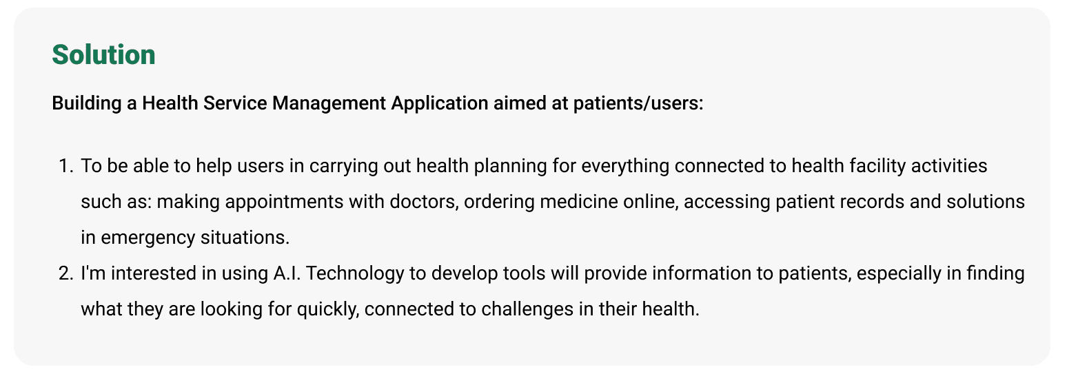
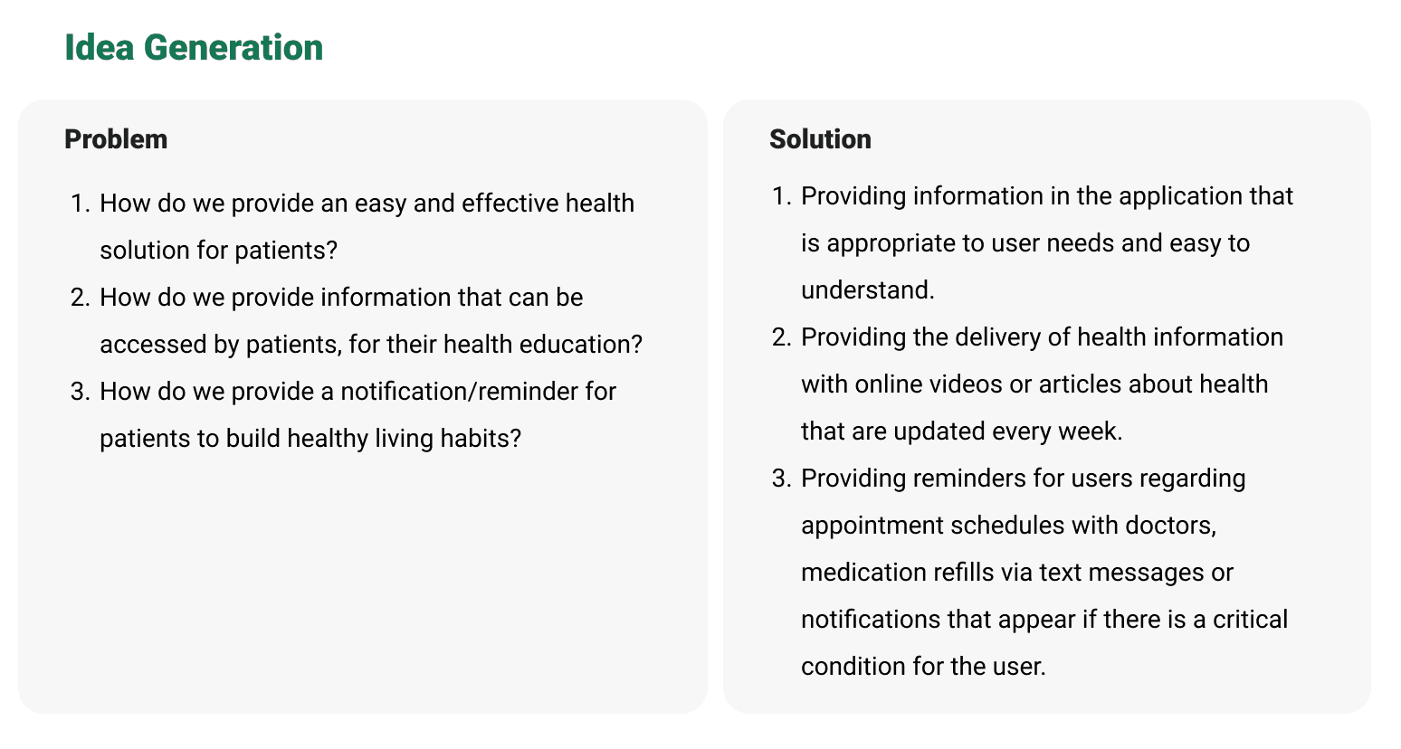
With so many aspects that 2 users can focus on, there are a variety of wants and needs. However, the most common need is their need for a complete and reliable information medium. Therefore, I focused on combining information that would help me in developing this application. With information, complaints and also directions from users, I plan to enter the information directly into the application.
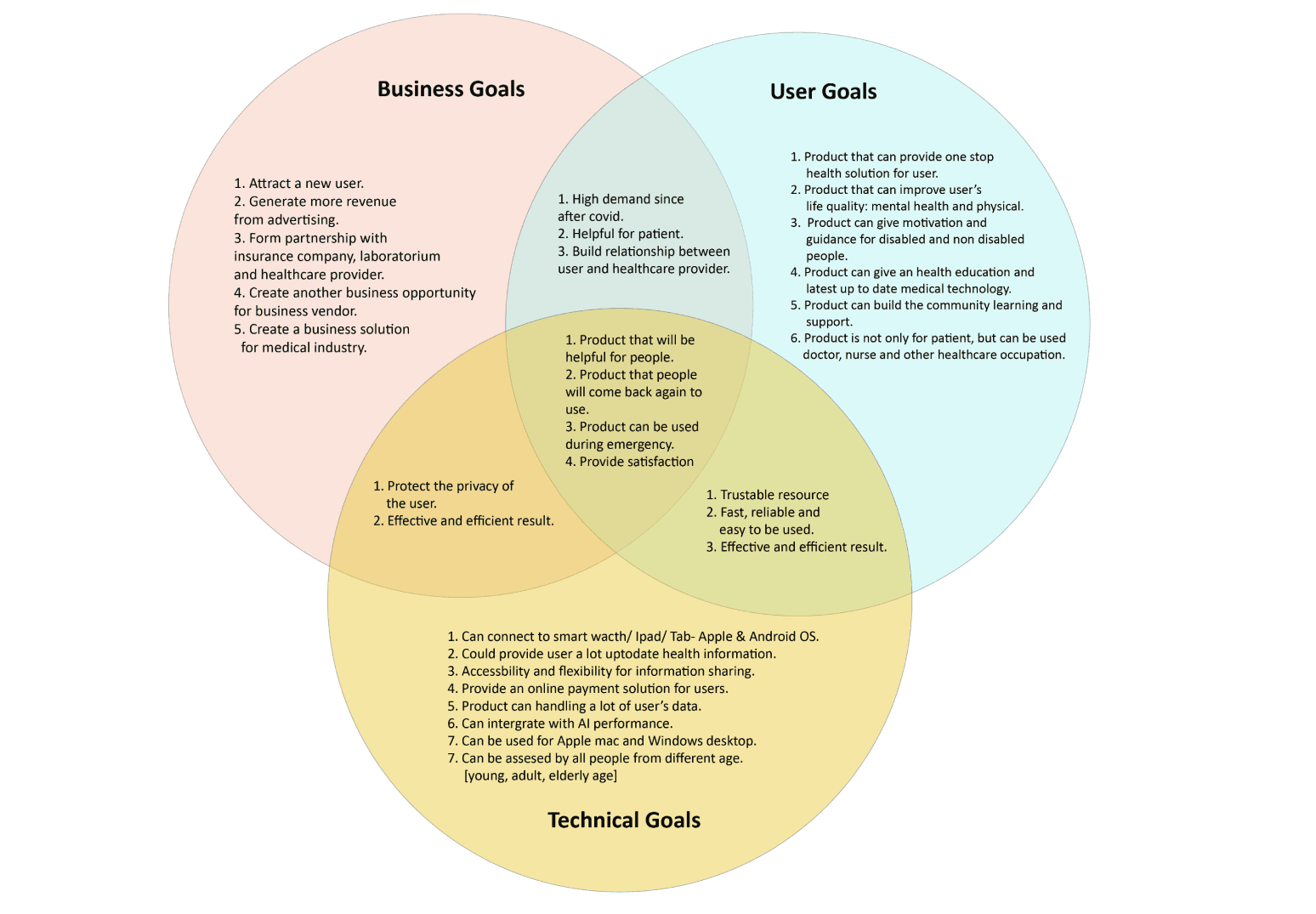
Product Goals
In this application, my considerations regarding the usefulness of this application are focused on user needs, business development for the company, and technical obstacles that need to be continuously improved.
Ideation
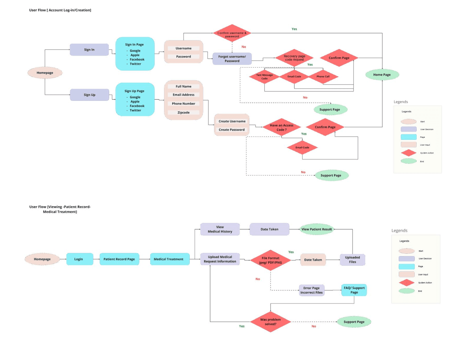
Building the Structure [User Flow]
To ensure that users like Kim and Mark would be able to navigate the app, I drafted User Flows to illustrate their likely steps as they complete basic tasks.
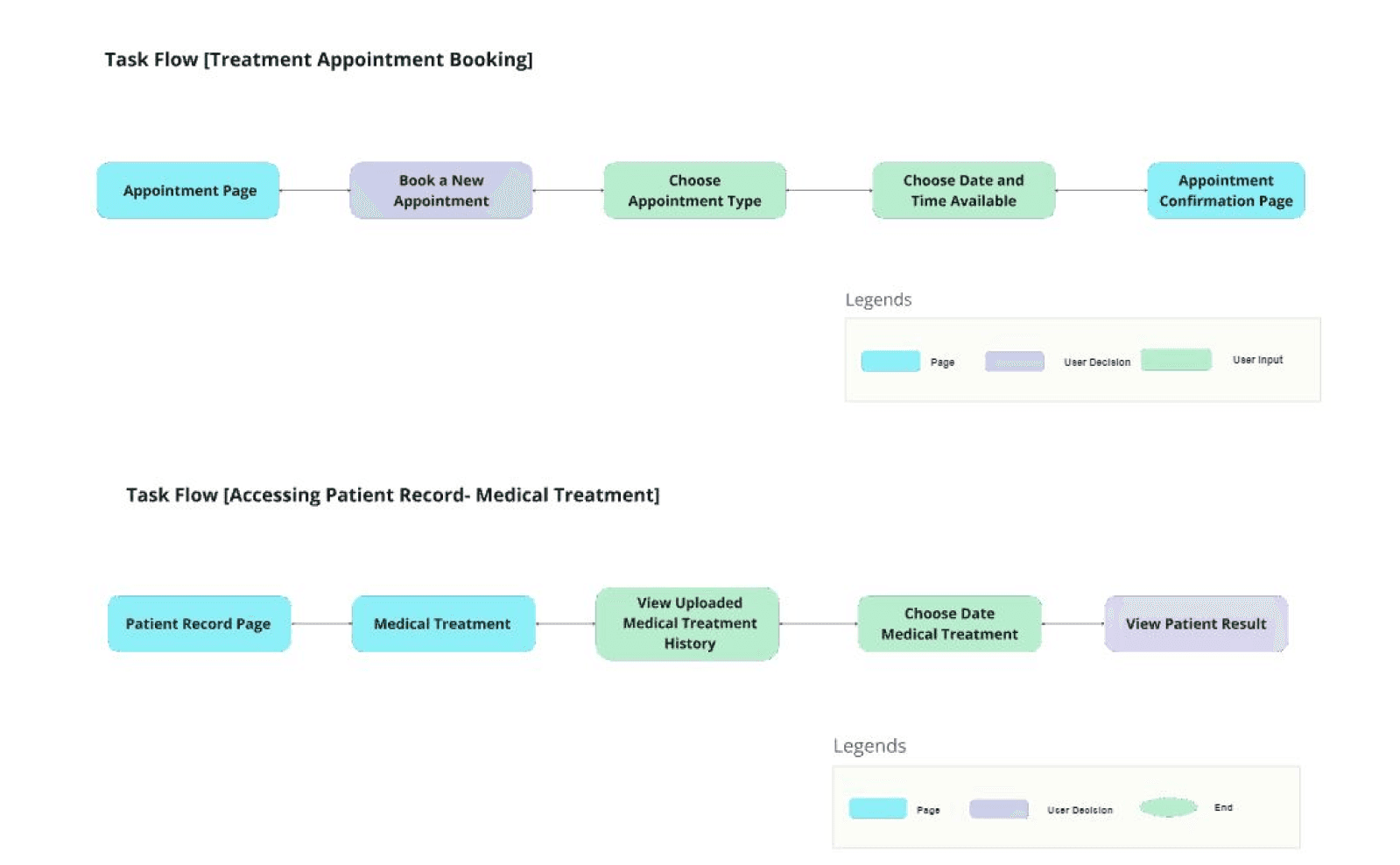
Task Flow
To ensure that users like Kim and Mark could navigate the application, I created a Task Flow to illustrate clear and concise steps in solving their problems.
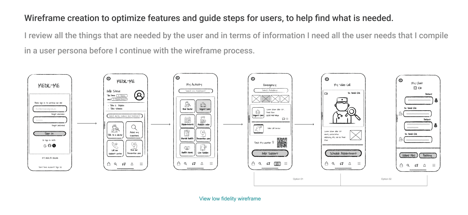
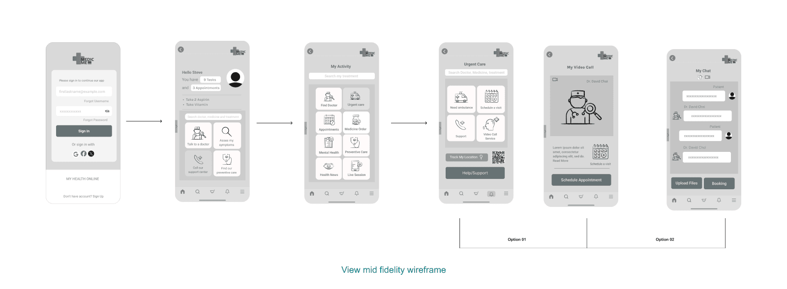
Low-Fi Wireframes & Mid-Fi Wireframes
Building The Brand
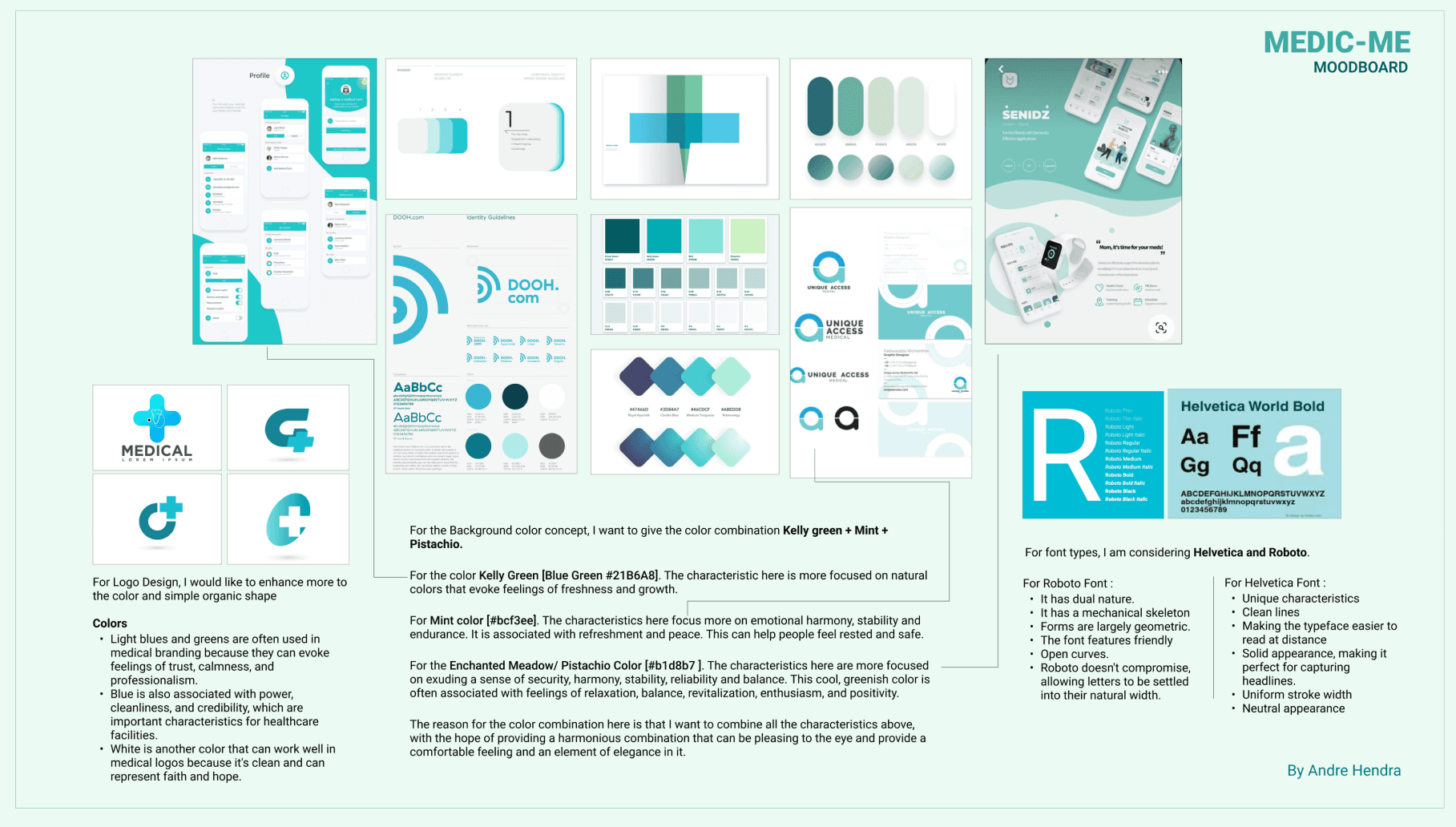
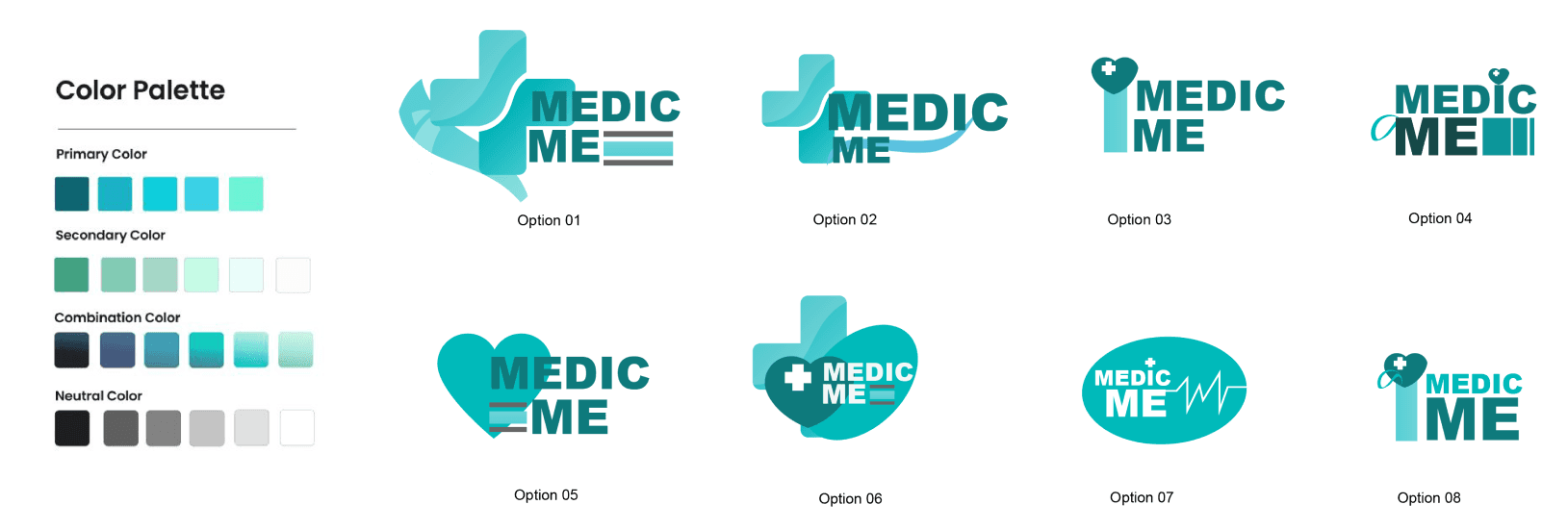
When creating this brand, I wanted to combine an elegant design and colors that are attractive to the user, focused on recovery and protection.
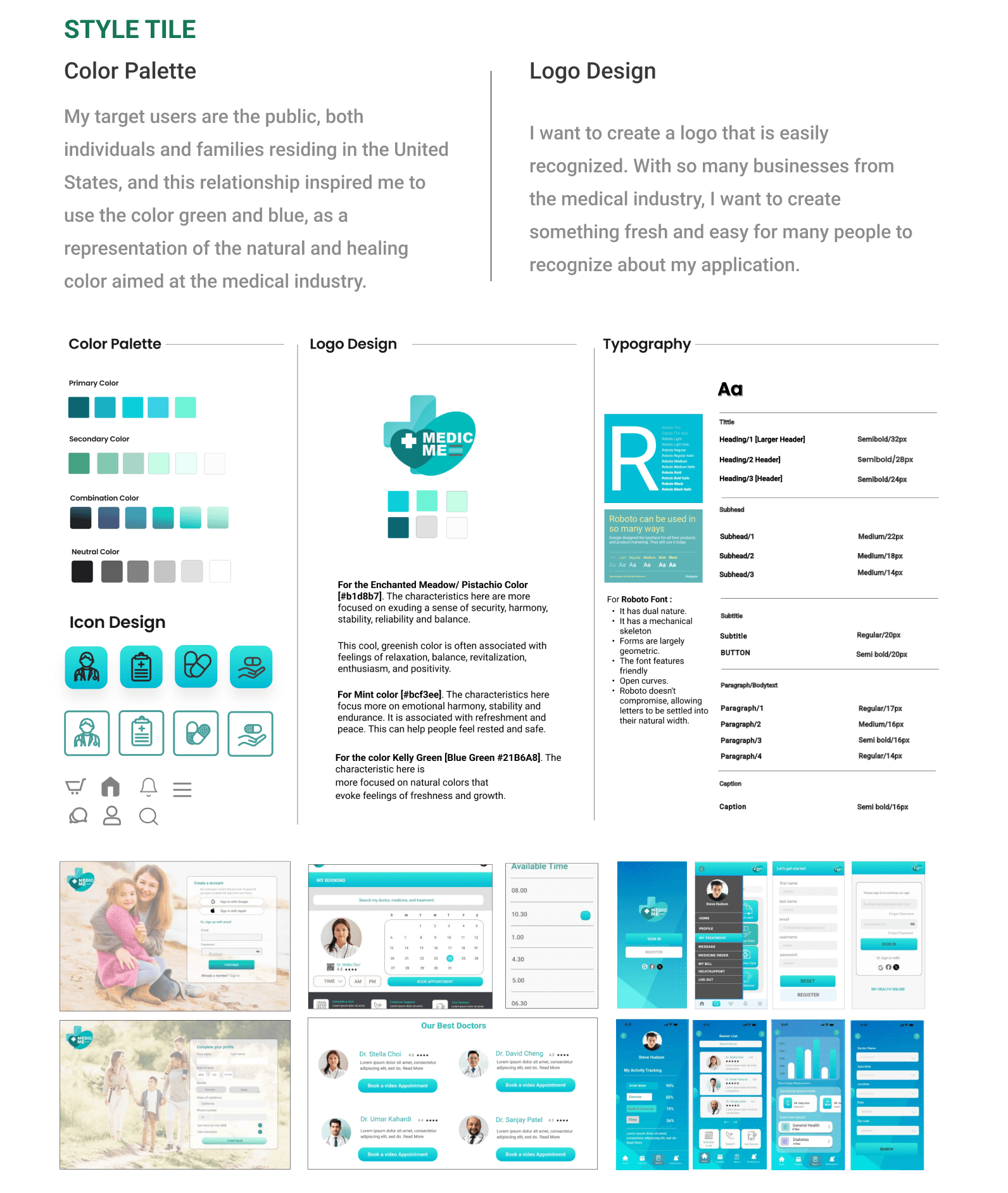
Putting It All Together
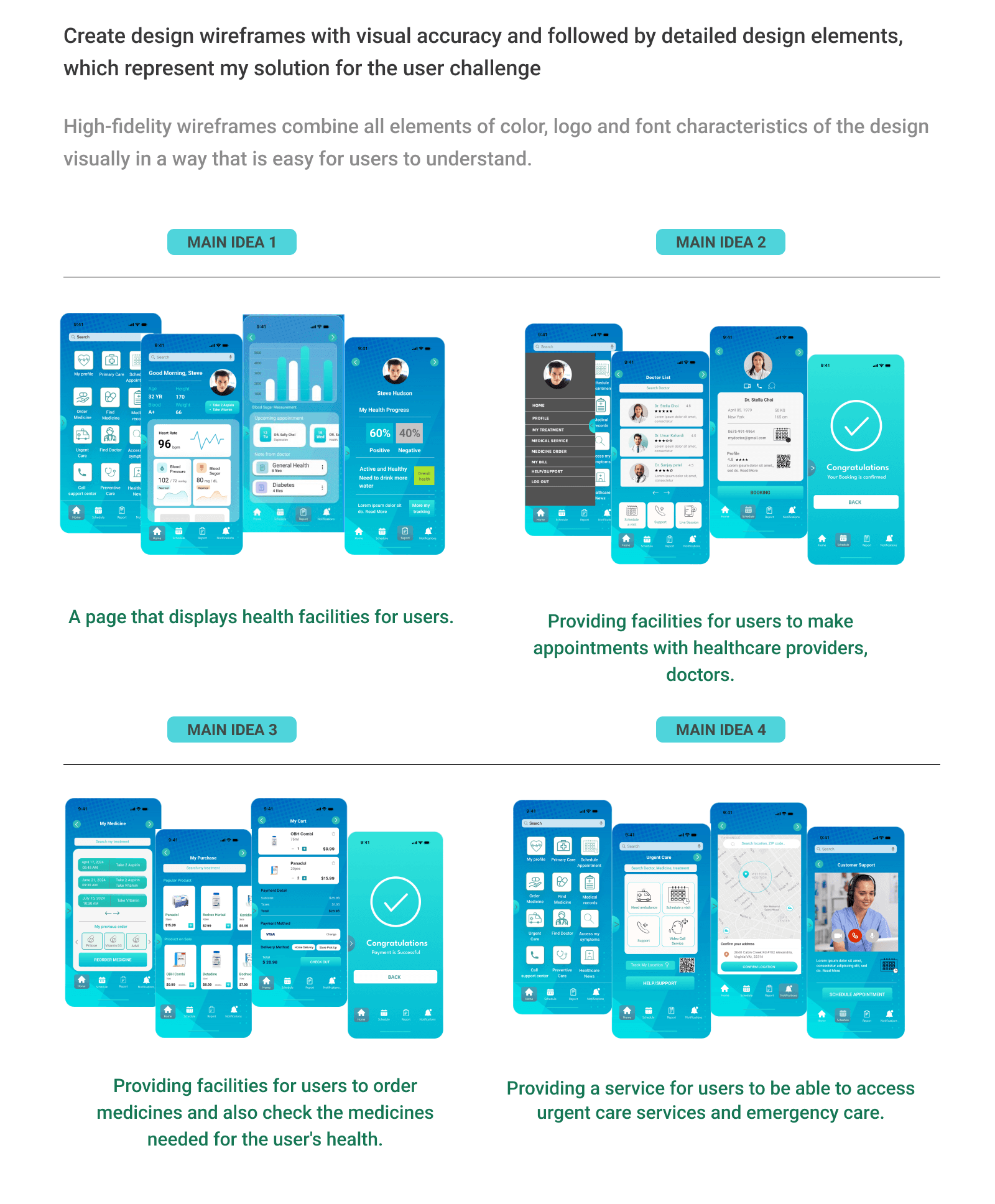
Hi-Fi Wireframes
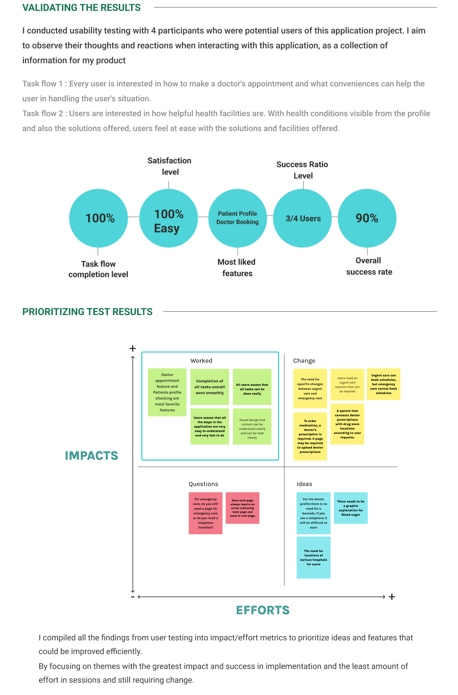
Iterations
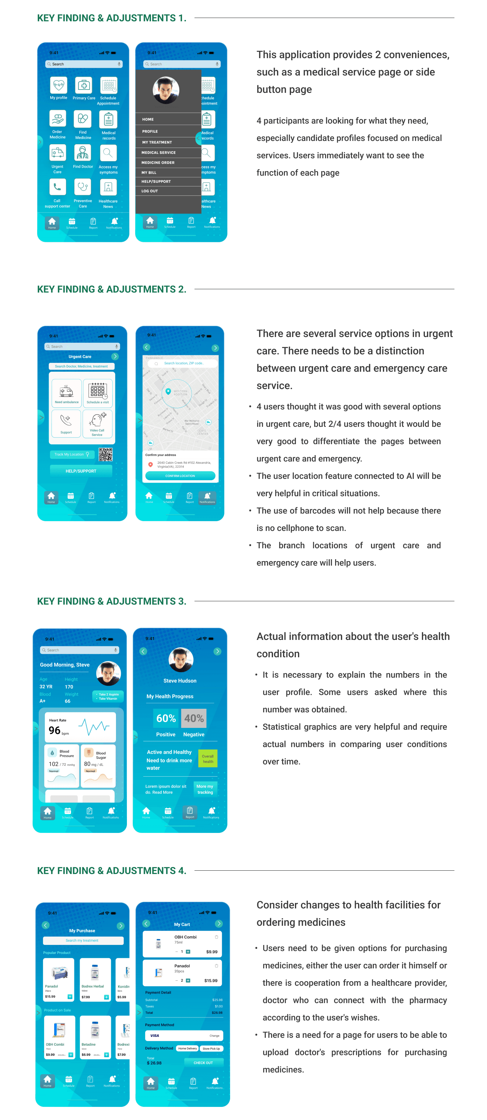
Through the first round of testing, I realized that the updated option interface was more attractive and more in line with industry needs. For this reason, I did not change the function but made the appearance and background more attractive to users.
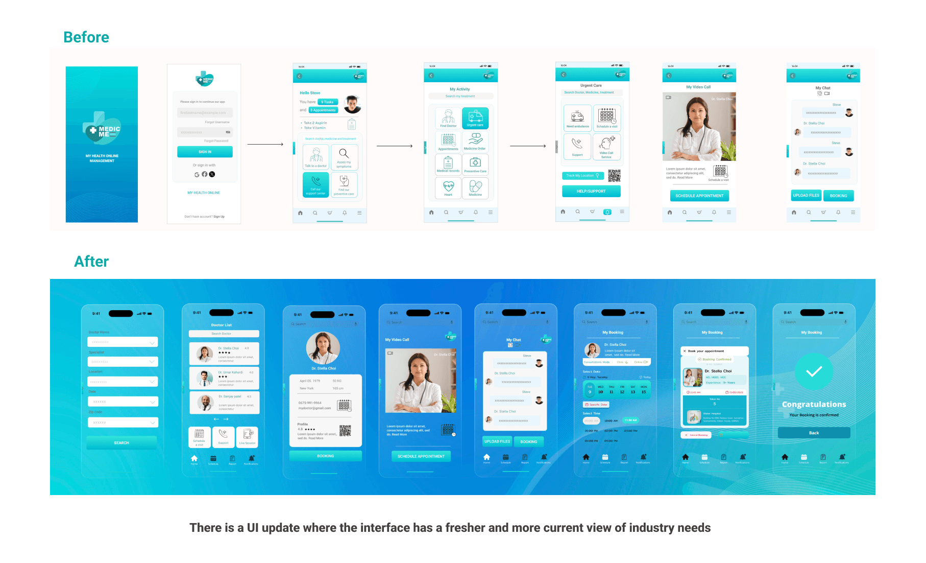
Final product
Final Thoughts
This project is my first time designing an application. Looking at my learning process, I try my best to design what users might need, especially in the health area. When conducting interviews with users, I try to put them in the user's position, especially to understand how they think, who come from different ages and have different experiences with technology.
In the research phase, I tried to understand what the majority of people in the USA might need, as health is always the biggest need and costs the most money.
Even though this is my first project, apart from my great motivation for my learning process, I also have great hopes of being able to create an application that really helps the community and I hope that this application can add more value, especially in terms of confidence in trying new things and can also provide solutions to what the community needs.
TAKEAWAYS
When carrying out the design process, I consider simplicity, clarity, and neatness to be important elements in the design process.
When creating this application, I considered what users of various ages needed and not only function, but I also tried to find new trends in the UX industry, but I still paid attention to the simplicity of everything.
Apart from that, I also think that designers often focus more on what they like, but in this case, I put aside what I like, I think more about if this product was circulated among the public, would this be able to help and provide clarity for them? This requires a lot of practice and experience, I really enjoyed the learning process in my first product application.
