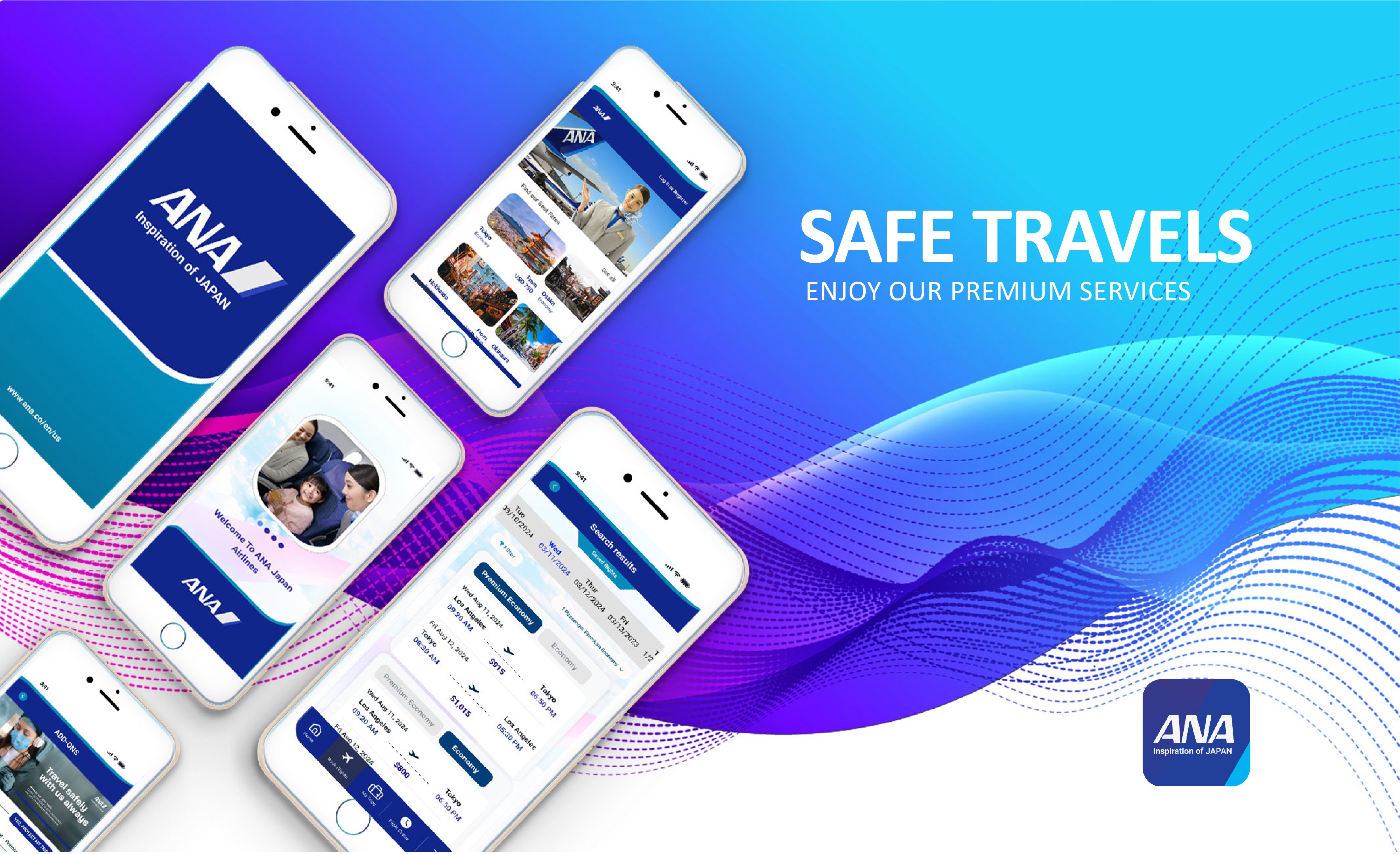
Re-branding, Web and Product Design for the ANA Airline application dedicated to travel lovers, both individuals and families
Project Type
Redesign End to End Application and Responsive Web Design
Role
Solo Product Designer; Research and Development; Brand Design; Ui/UX Design; Prototype Testing
Tools
Figma, Miro, Framer, Photoshop, Illustrator, Office 365, OBS Studio
Introduction
Background
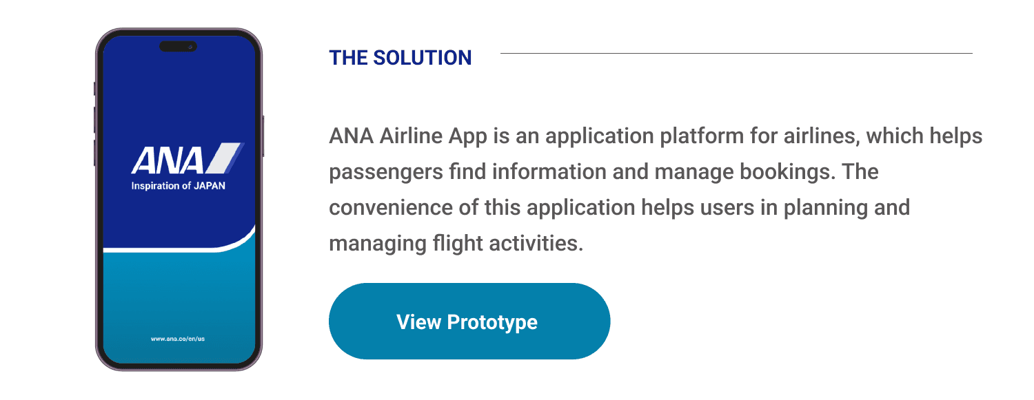
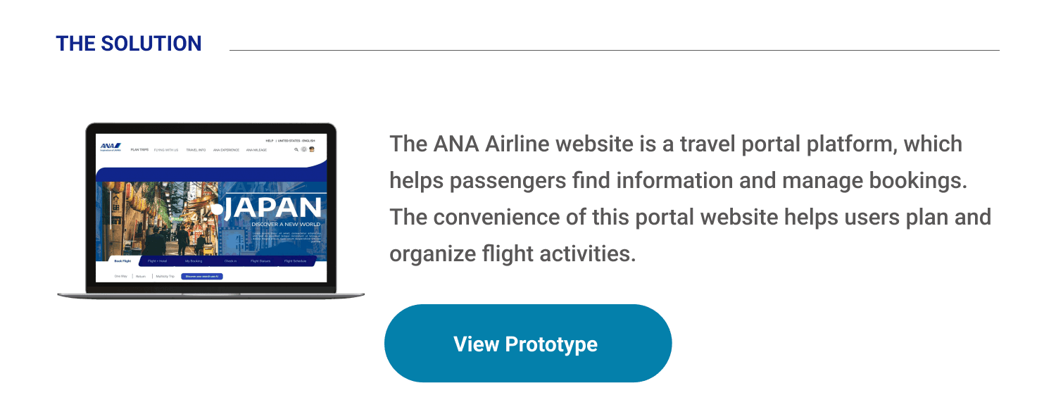
ANA Airline App is an application platform for airlines, which helps passengers find information and manage bookings. The focus of using the application here is to provide convenience for users and solutions for the aviation industry. The success of the service really depends on one thing: Customer satisfaction.
The Problem
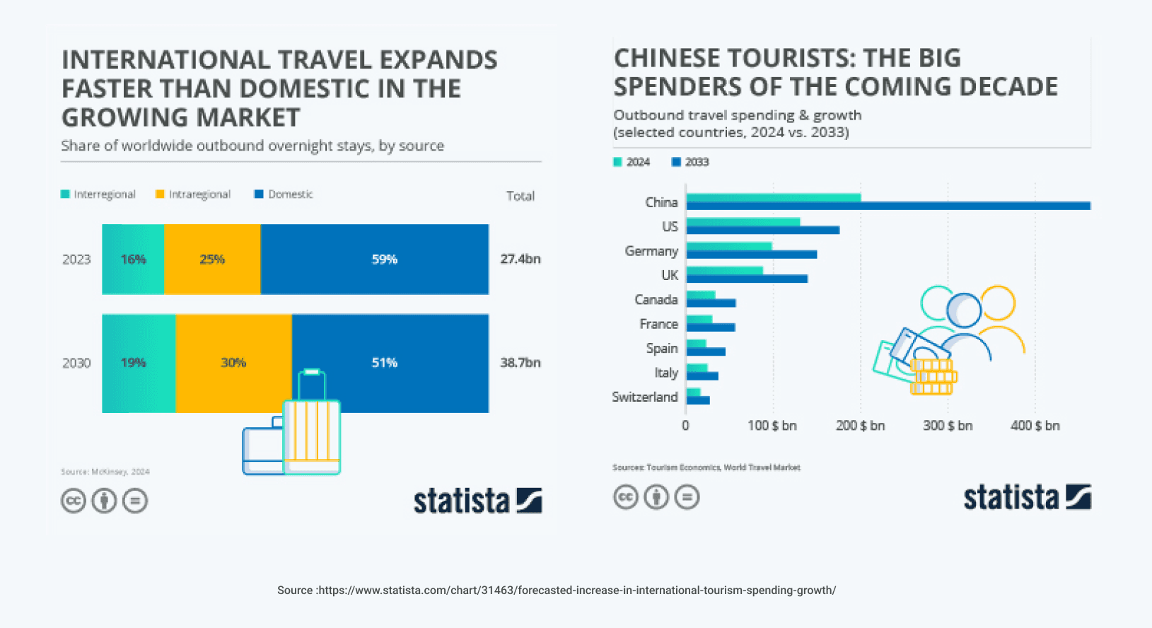
To research information that I got in 2016, IATA [ International Air Transport Association] predicts that 7.2 billion passengers will travel by air in 2035 - almost double the 3.8 billion passengers in 2016. With increasing demand, this provides competition in the travel industry. Airlines will need to attract the attention of new travelers while increasing loyalty among existing customers.

Understanding the Problem
All Nippon Airways (ANA) is currently the largest airline in Japan and has plans to increase its growth, with the aim of improving efficiency and increasing international passenger revenues by 40% by 2020. ANA sought to use data insights to understand patterns in demand, react to an always-changing environment with tailored pricing strategies, and identify new revenue opportunities.
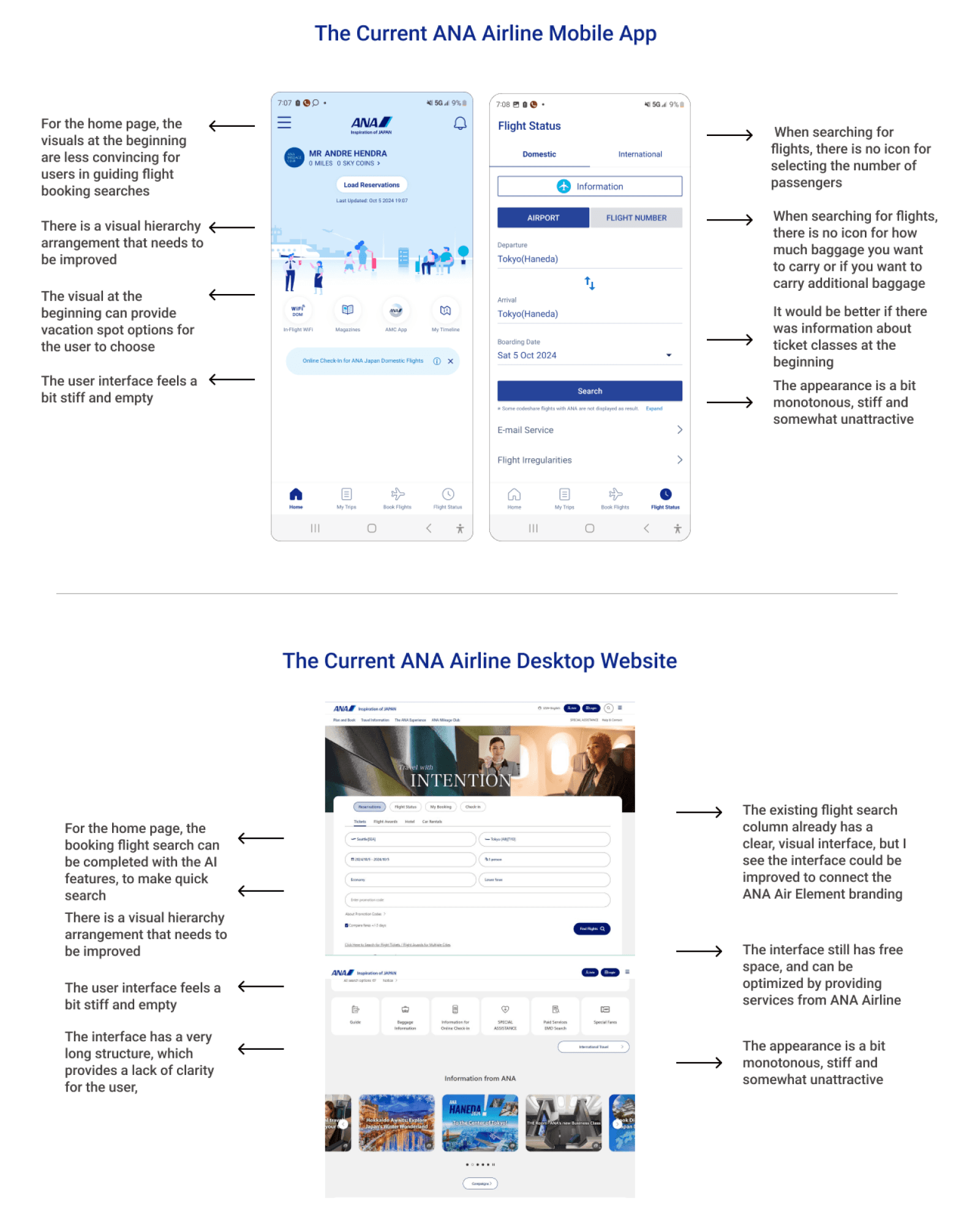


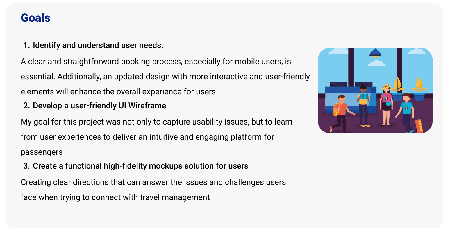
Analyzing Research Data

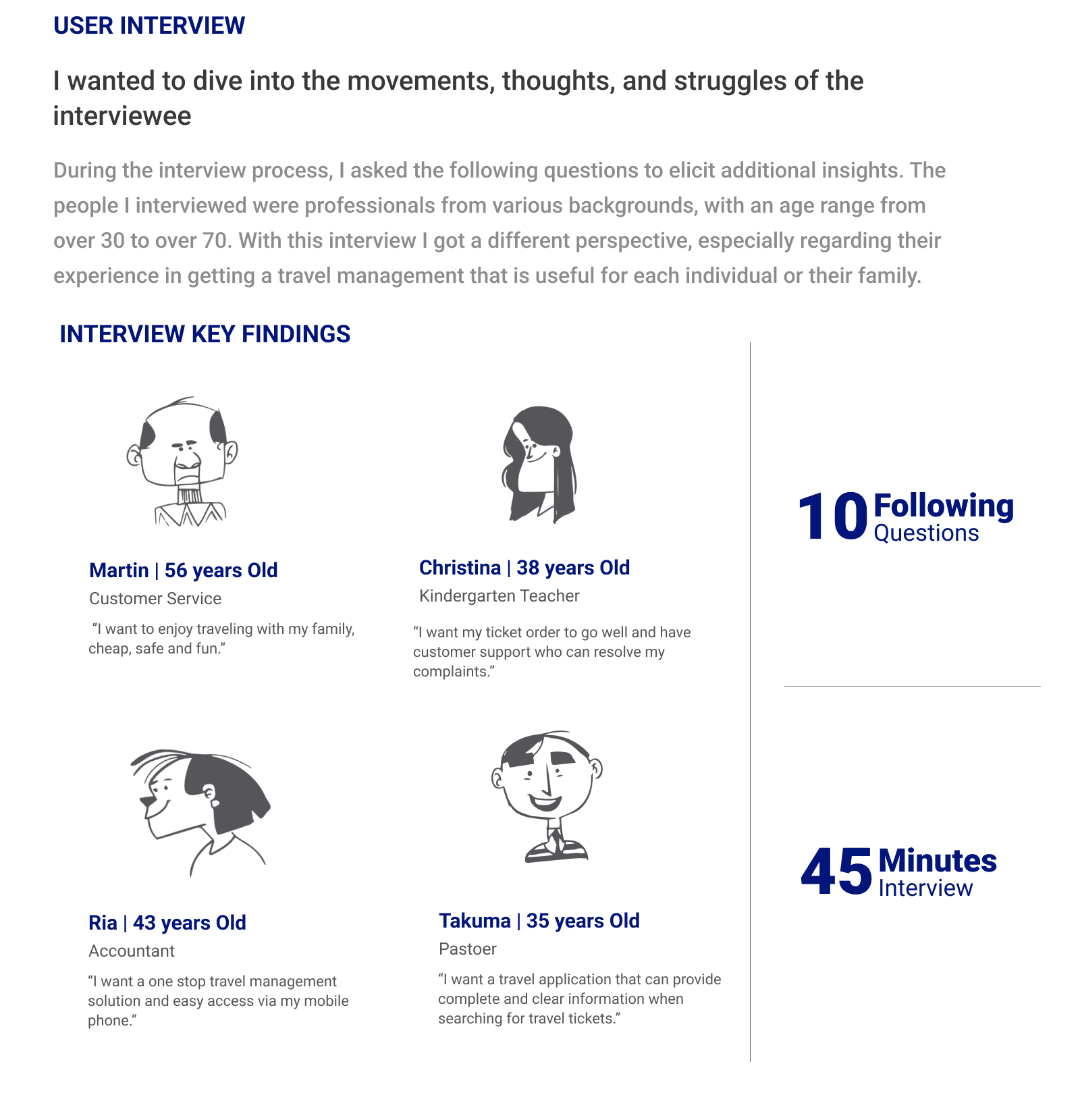
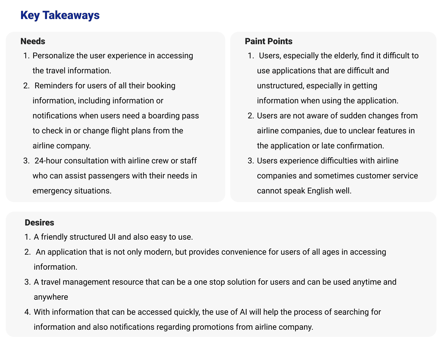
Affinity Mapping
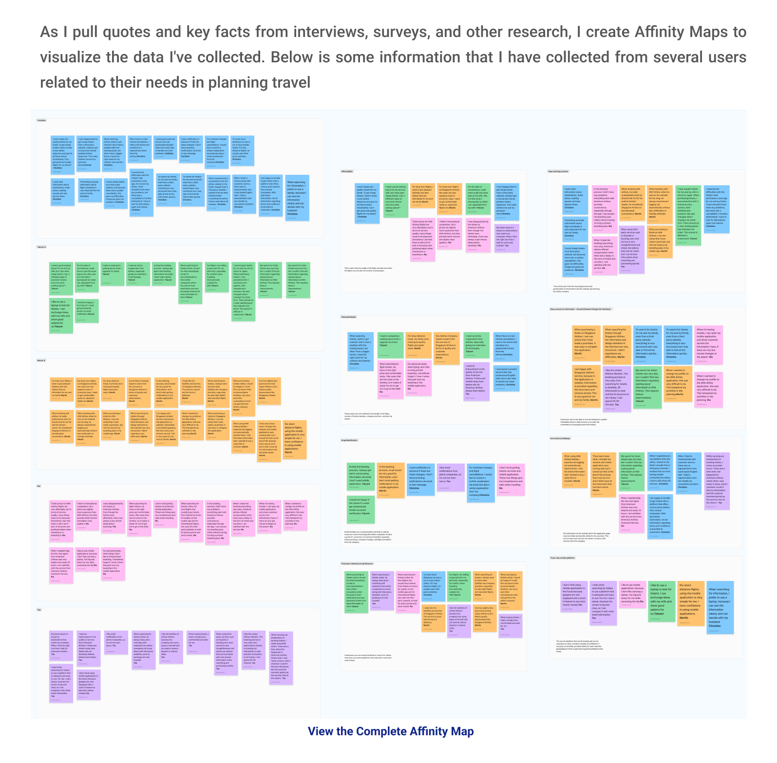

Meets the users: User Personas
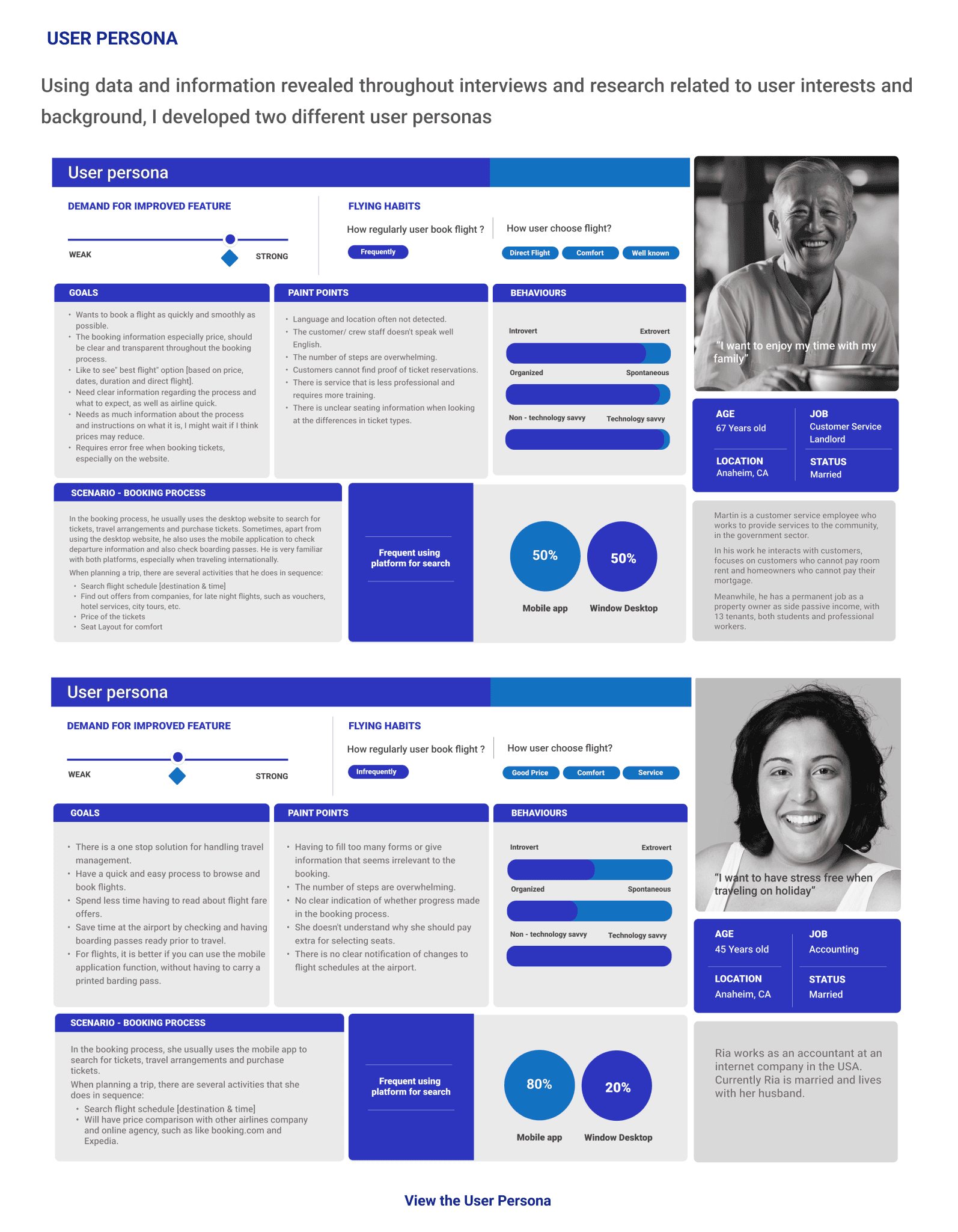
By using information and opinions expressed through surveys, interviews, and related research, I developed two personas for my 2 candidates: Martin, a professional who works as customer service in the Government Sector, and Ria, a professional accountant who works in a corporate company. They provide information and whatever the candidates need as well as all their complaints related to the development of this application.
What I learned from the Personas
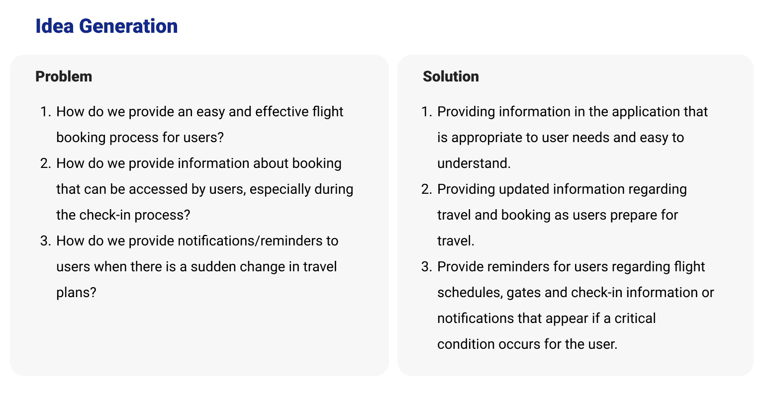
With so many aspects that 2 users can focus on, there are a variety of wants and needs. However, the most common need is their need for a complete and reliable information medium. Therefore, I focused on combining information that would help me in developing this application. With information, complaints and also directions from users, I plan to enter the information directly into the application.
Product Goals
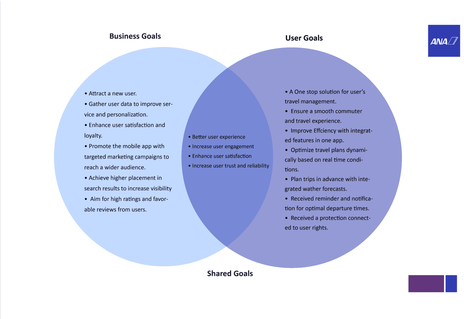
In this application, my considerations regarding the usefulness of this application are focused on user needs, business development for the company, and technical obstacles that need to be continuously improved.
Ideation
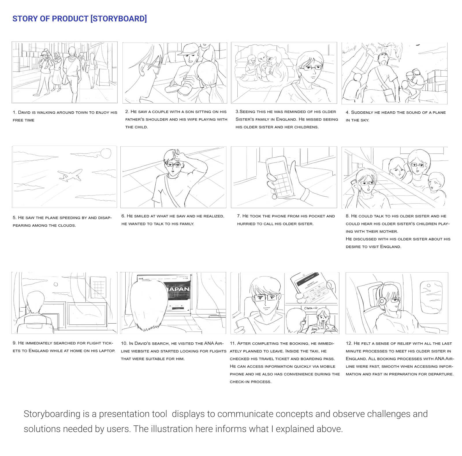
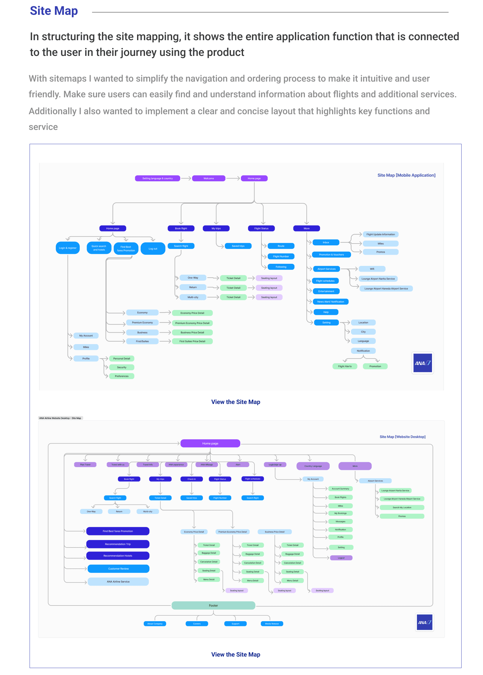
Building the Structure [Site Map]
User Flow
By visualizing the tasks the user should be able to do when using the application, I created two User flows to identify and understand how the user would navigate through the ANA Airline Application. This acted as a guide for determining the functional requirements and the navigational links for the wireframes.

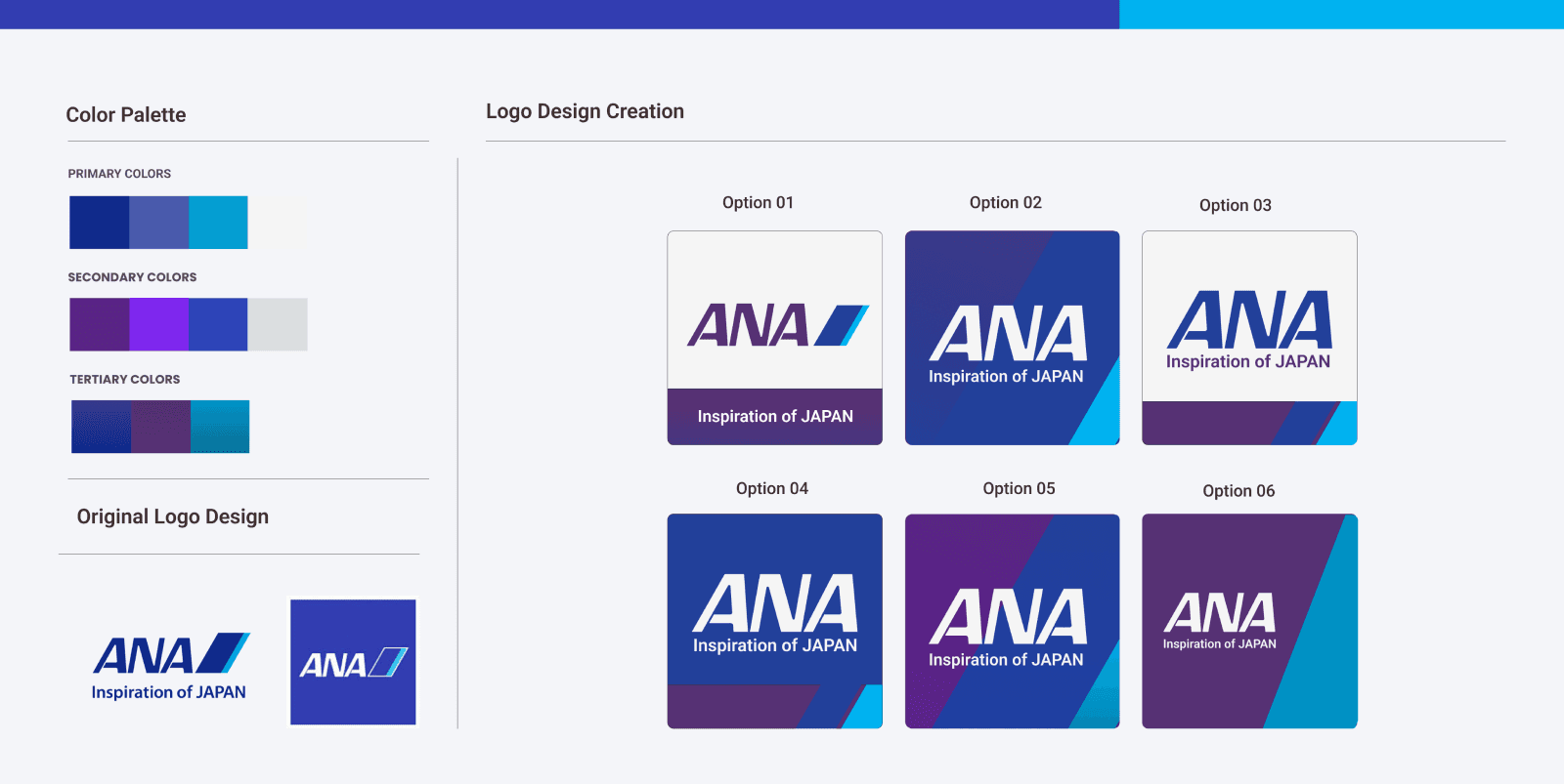
Building the Brand
When creating this brand, I wanted to incorporate a clean, elegant and fresh design style. For the selection of design elements, I continued to use the original ANA Airline branding, but I made structural changes through the color palette.

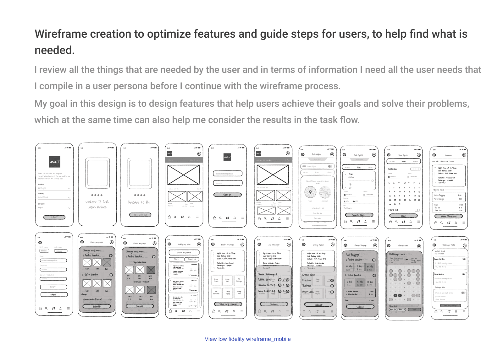
Putting It All Together
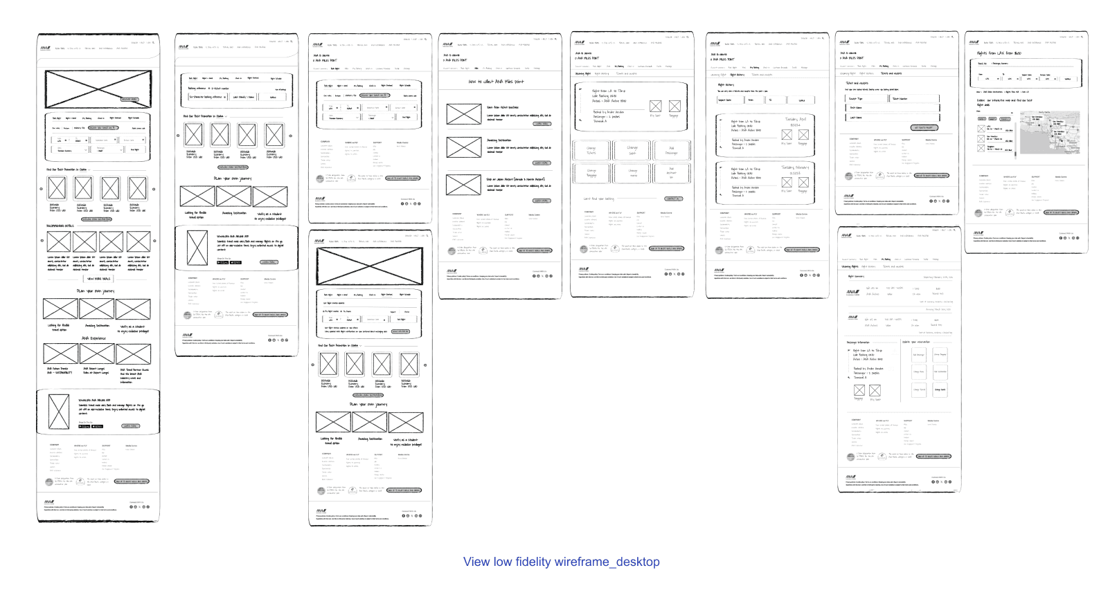
Low-Fi Wireframes & Mid-Fi Wireframes
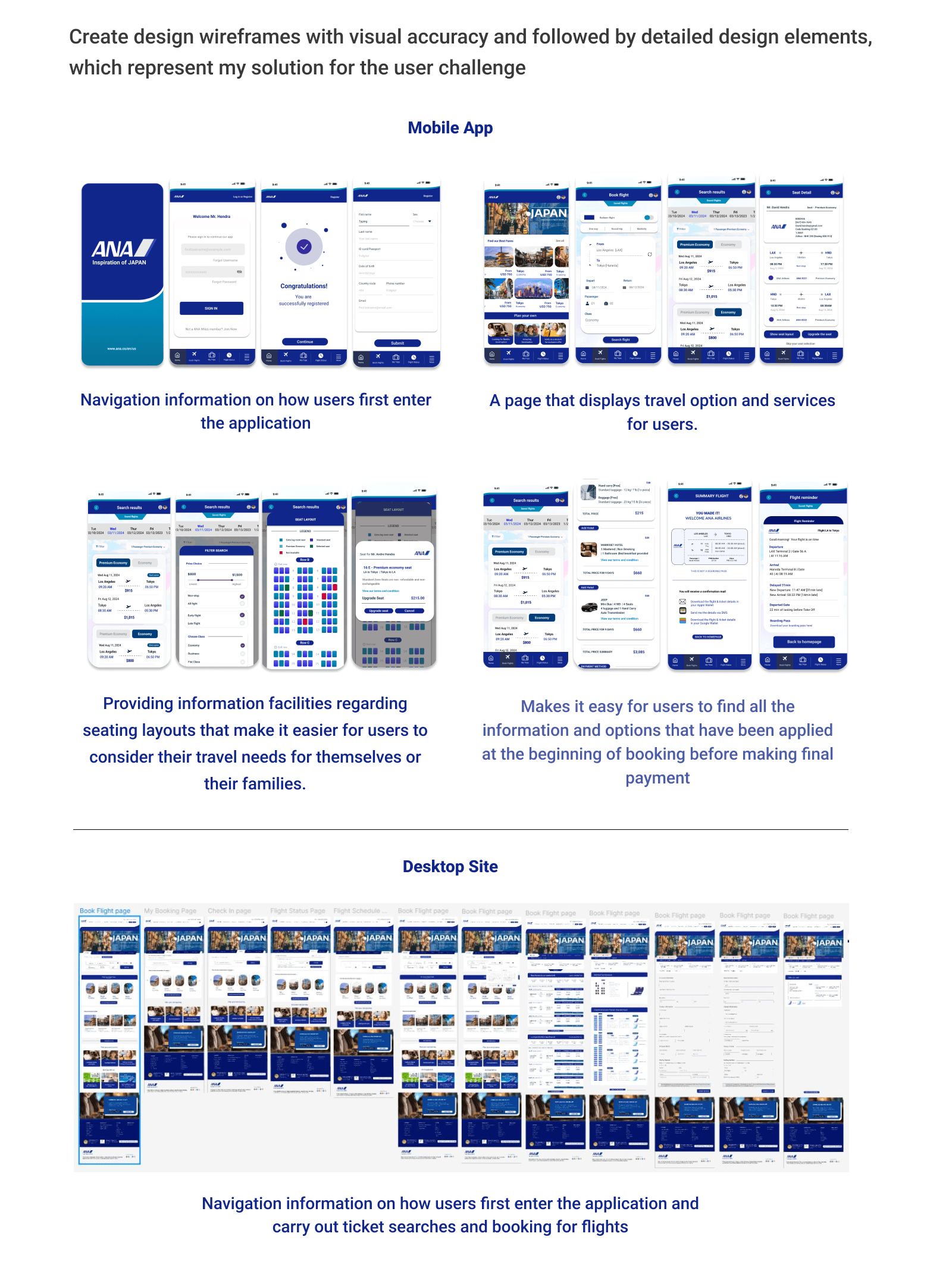
Hi-Fi Wireframes
Iterations
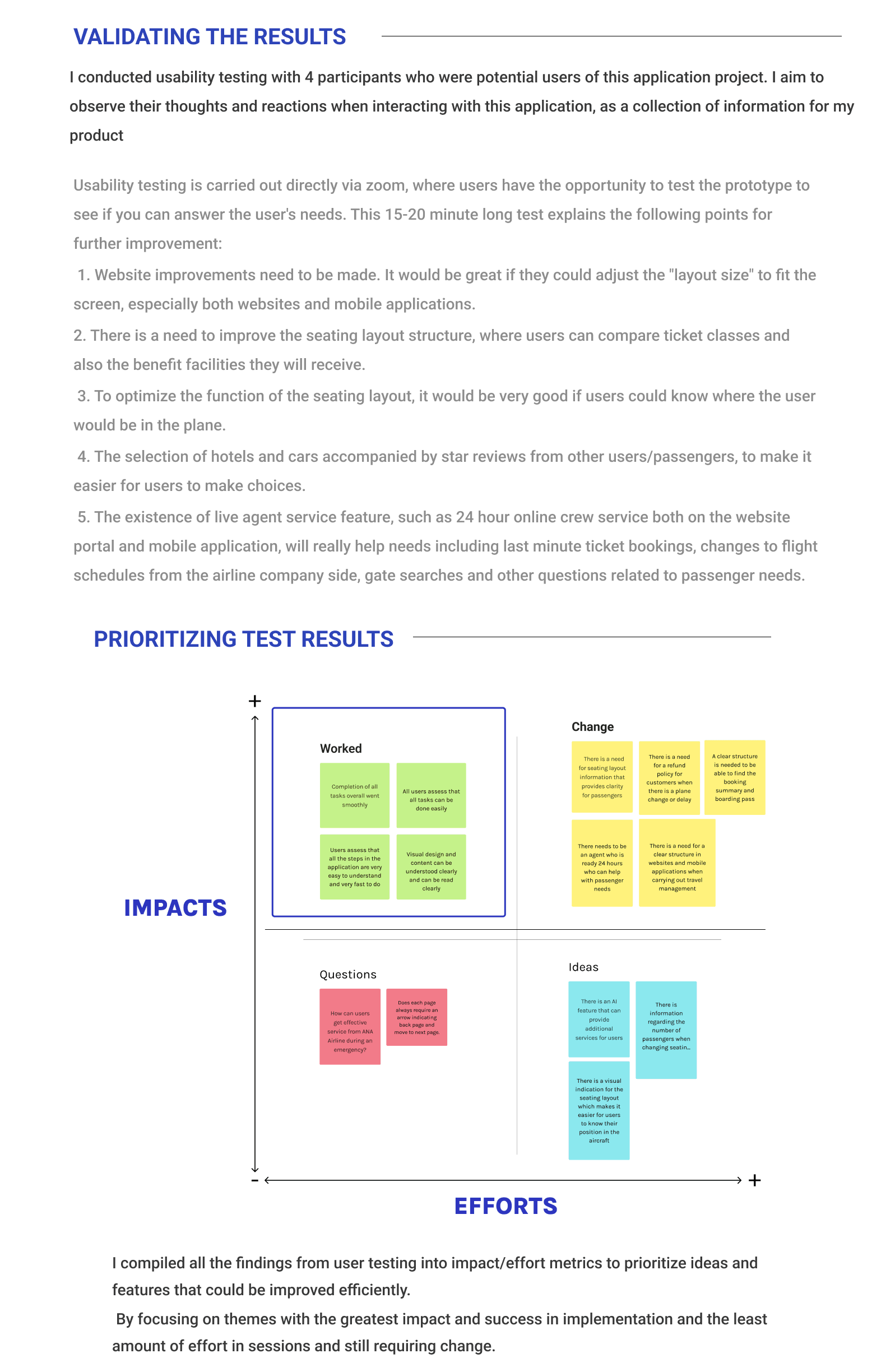
Through the first round of testing, I realized that visual overload, particularly on the seat change page, was generally an issue for people when navigating the ANA Airline App for either mobile or desktop sites. Bearing in mind that my goal is to make it easier to plan flights that are visually appealing, I upgraded the visual appearance of the seating layout based on the feedback I received.

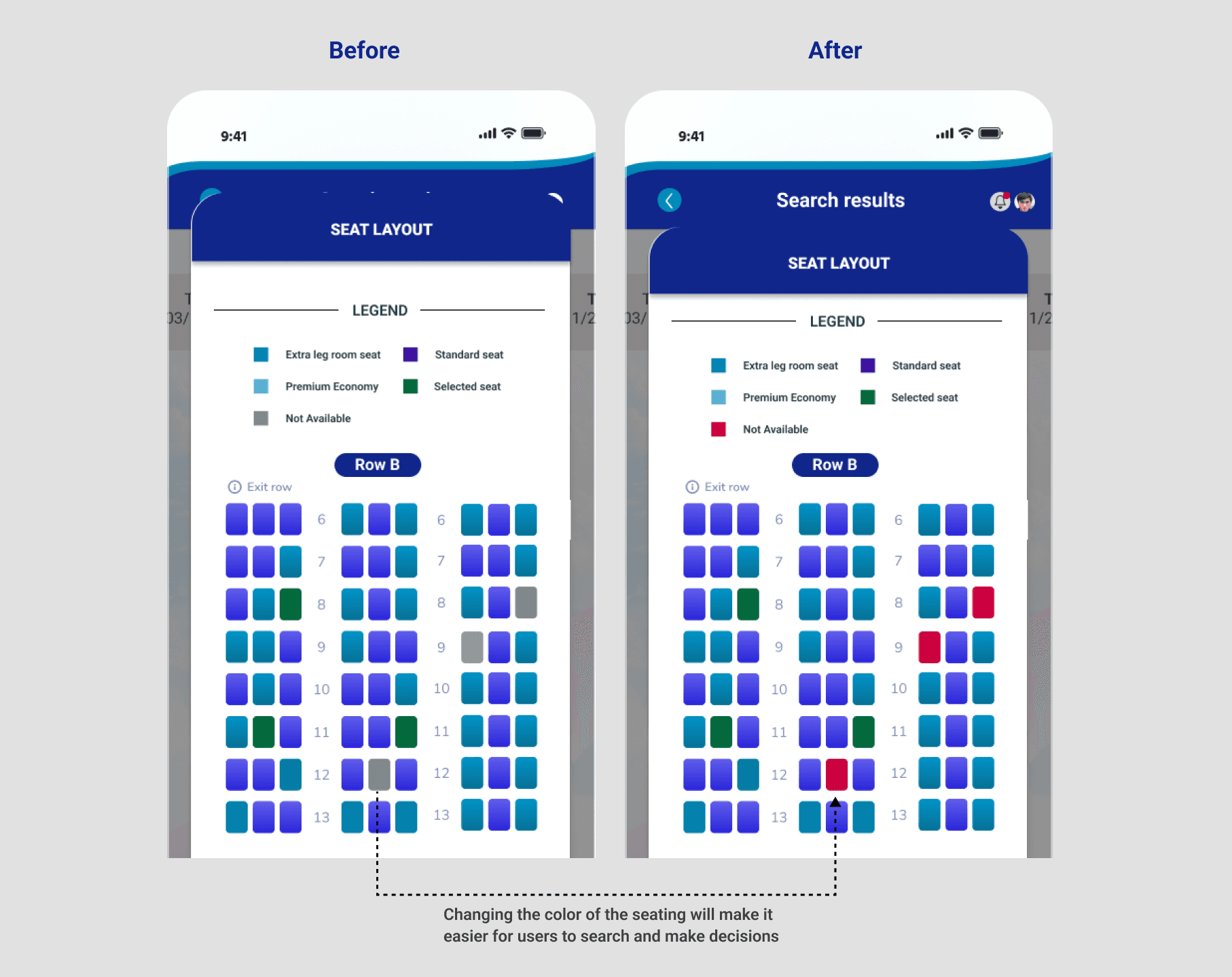

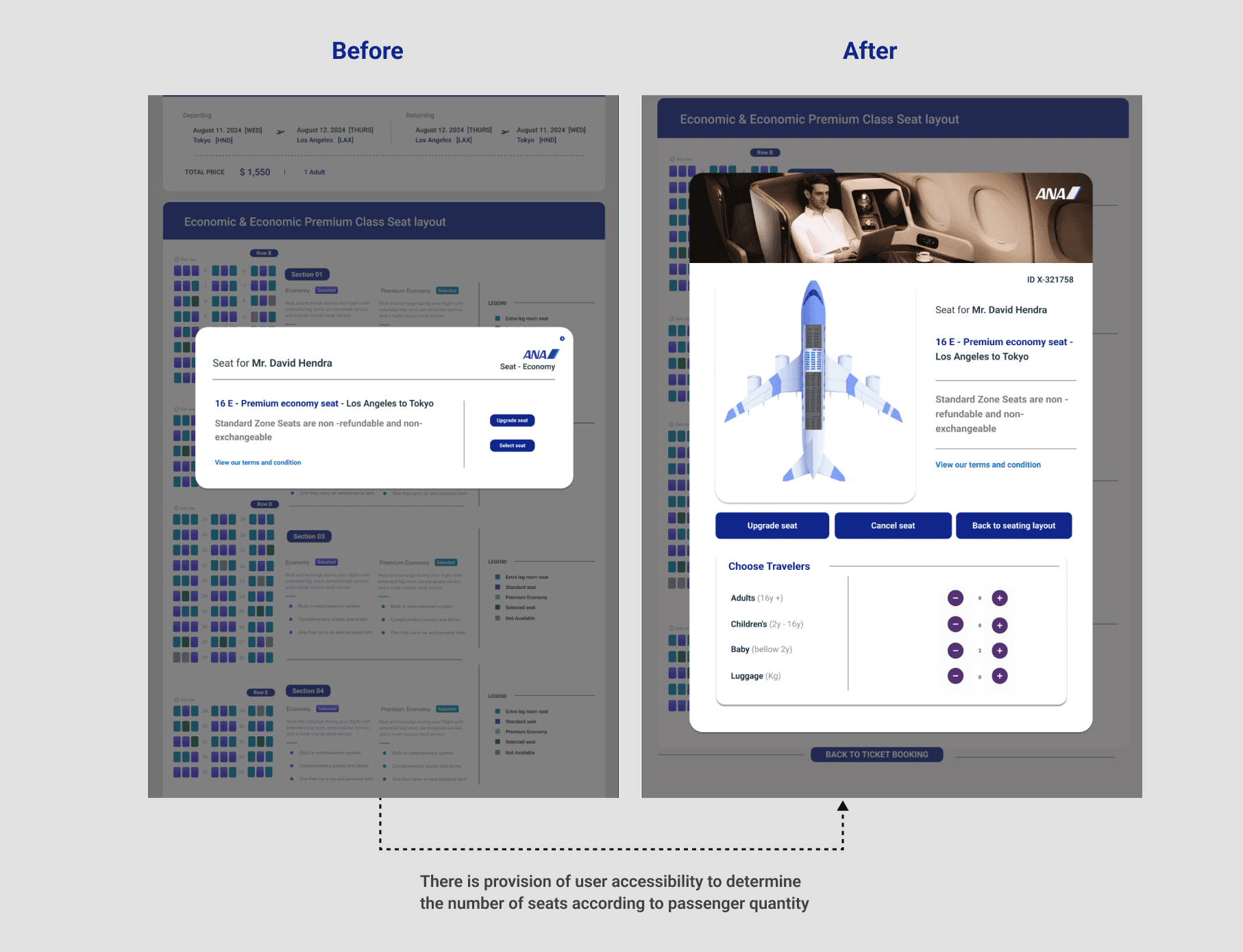
5 users said that choosing a seat location made them clearer in their considerations, compared to just choosing a seat at the end when making ticket payments. This visual representation represents most users, professionals, couples, and families who have many family members.
Given the visual improvements here, users appreciated the visual appeal and interest, which I adapted for my final design.
Final product
Final Thoughts
The second project was the first time I challenged myself to do more in my project, where I decided to make a change to the product features of the ANA [Air Nippon Airline] application. As much as I like flying and often use the service from ANA Airline, I think ANA Airline has good service, but when ordering tickets I had a lot of difficulties and this gave me the desire to try new things in this second project.
TAKEAWAYS
If this project continues with ANA Airline, I will focus on three things:
1. Continue to develop the rest of the application, especially the check-out process. I will first consider the design of other major airline and travel booking sites.
2. Conduct usability testing with real users. I see this as very important to pay attention to, where testing must continue to be carried out and a lot of information must continue to be updated. Once the prototype was complete, I wanted to better understand what the user needs were and how I could identify further improvements, additional functionality needed, and future scaling capabilities.
3. There are improvements to features that will really help users in the future, which I think of is the AI Feature. I still want to observe what user needs are, and how users can adjust their needs through this feature.
