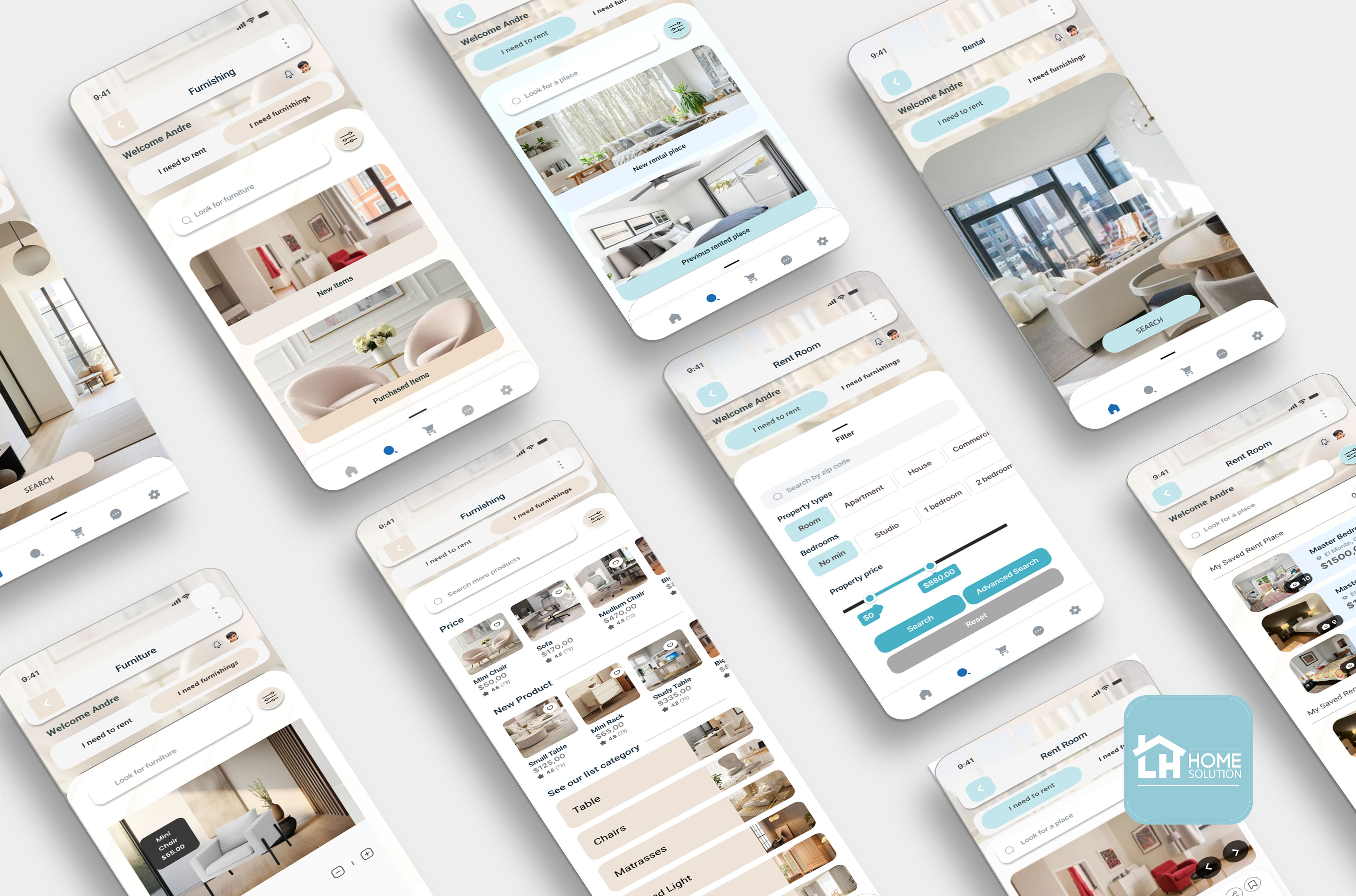
This case study describes a rental app that focuses on search place and furnishing that are useful for individuals and can be accessed anytime and anywhere.
Project Type
Mobile Website
Role
Solo Product Designer; Research; Brand Design; Ui/UX Design; Prototype
Company
Figma, Miro, Framer, Photoshop, Illustrator, Office 365, OBS Studio
Introduction
Background
California's total population increased by 0.17% — or about 67,000 people — to reach a total population of 39,128,162, according to 2024 year-over-year data from the California Section's Annual Report. This increase in numbers is due to the increase in the number of people immigrating to California cities, with supporting factors such as the search for a new life, opportunities to get jobs, and continuing with quality education.
With the factors outlined above, there is a great need for individuals living in California to find more affordable housing and the right resources to find appropriate information for their housing search. Apart from that, with the increasing need to search for housing, there is a huge need for individuals to search for furniture items, for this reason, with this application I provide a feature that can search for accommodation items for rental needs.
The Problem
With its calm climate and economic dynamism, California is often cited as one of the best places to live in America. This city is one of the most expensive cities to live in. Due to the imbalance between supply and demand, finding a place to live at a reasonable price has become a challenge.

Understanding the Problem
People moving to new cities or looking for a new place to stay were the targeted group for the app.
It had to be designed for a user looking for a room.
It is assumed the user is completely new to the city without any friends or relatives present, so safety is an important concern.

User and Audience
After looking at this issue, I have decided to tackle this issue. From this search experience, I have kept in mind a couple of pain points I wanted to solve:
Time, it takes a lot of time to search for places that match my expectations
Reliable information resources need information resources that are a one-stop solution for users.
My challenge when designing the Smart Home Solution application was to create a straightforward solution for the entire experience of finding rentals and purchasing furniture for customers. One thing that makes it difficult for users is that sometimes when they search for something there are too many choices and the information is not on target, so this issue wastes their time. I have tried my best to empathize with app users and address their needs and concerns effectively. Overall, this project highlights the importance of user-centered design and the value of continuous testing and iteration to achieve an optimal user experience.

Analyzing Research Data
Affinity Mapping
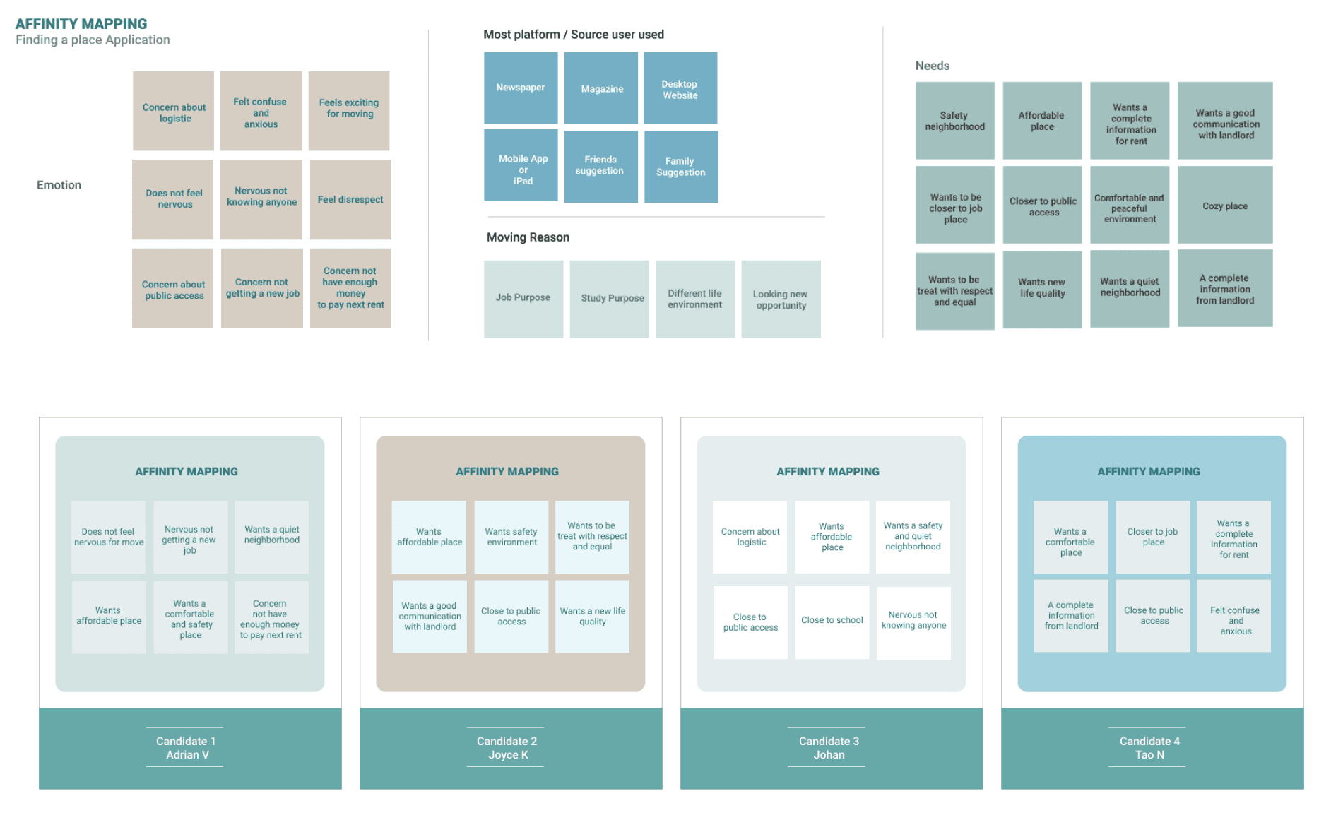
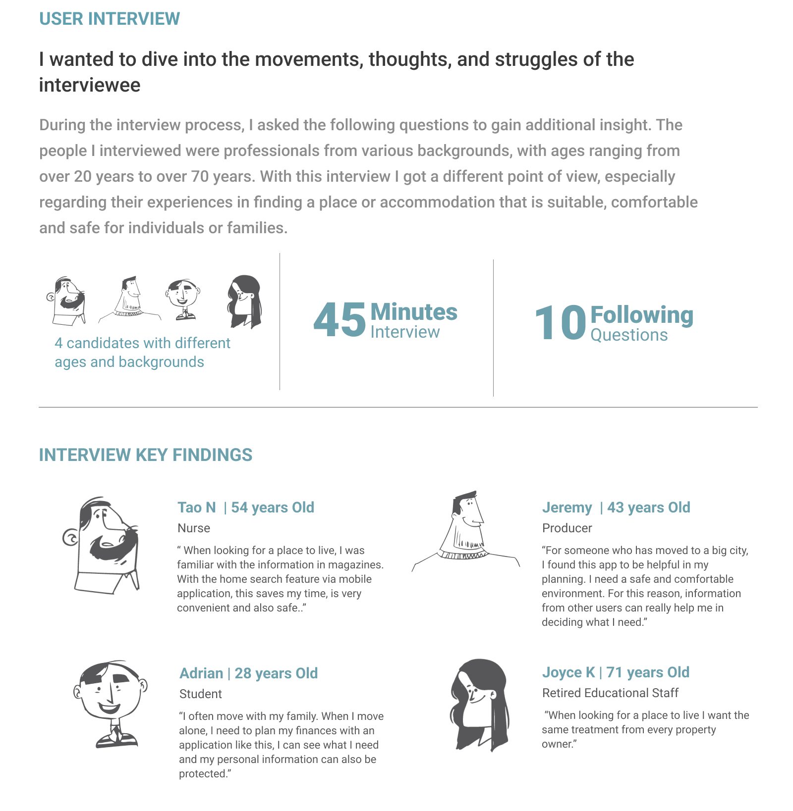


Meets the users: User Personas and User Journey Map
Using information and opinions expressed through surveys, interviews, and related research, I developed two personas from my 2 candidates: Joyce, a retired woman who once worked in a school district, and Adrian, a student who is planning a move to study needs. They provide information and what the candidates need and all their complaints related to the development of this application.
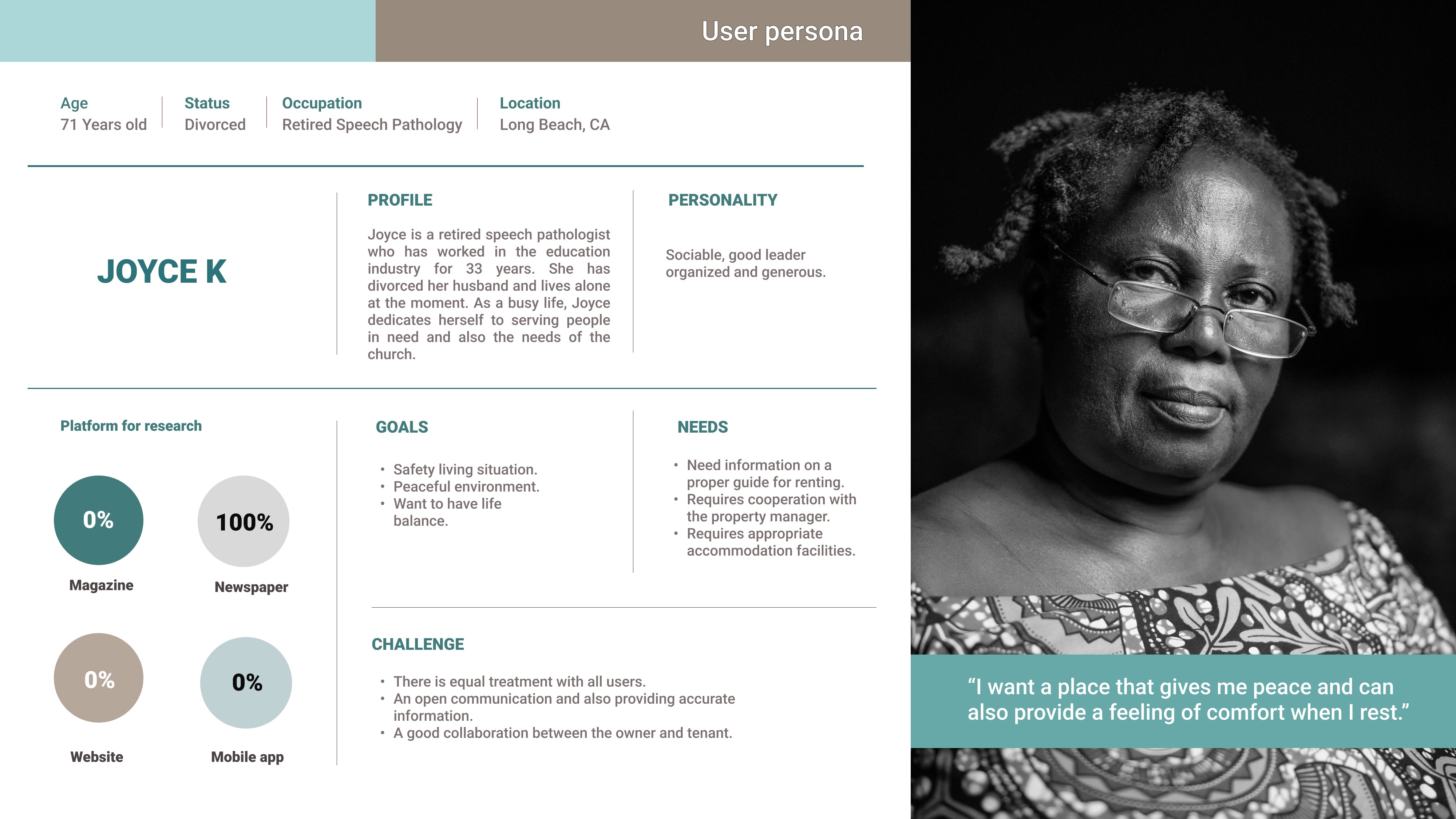


What I learned from the Personas
With so many aspects that 2 users can focus on, there are a variety of wants and needs. However, the most common need is their need for a complete and reliable information medium. Therefore, I focused on combining information that would help me in developing this application. With information, complaints, and also directions from users, I plan to enter the information directly into the application.
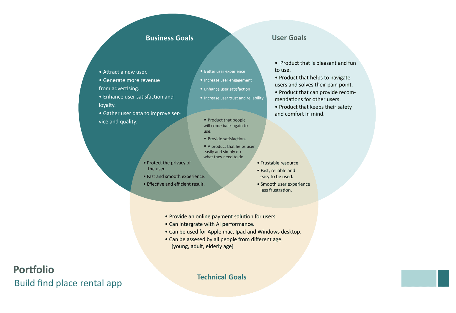
Product Goals
In this application, my considerations regarding the usefulness of this application are focused on user needs, business development for the company, and technical obstacles that need to be continuously improved.
Ideation

Building the Structure [User Flow]
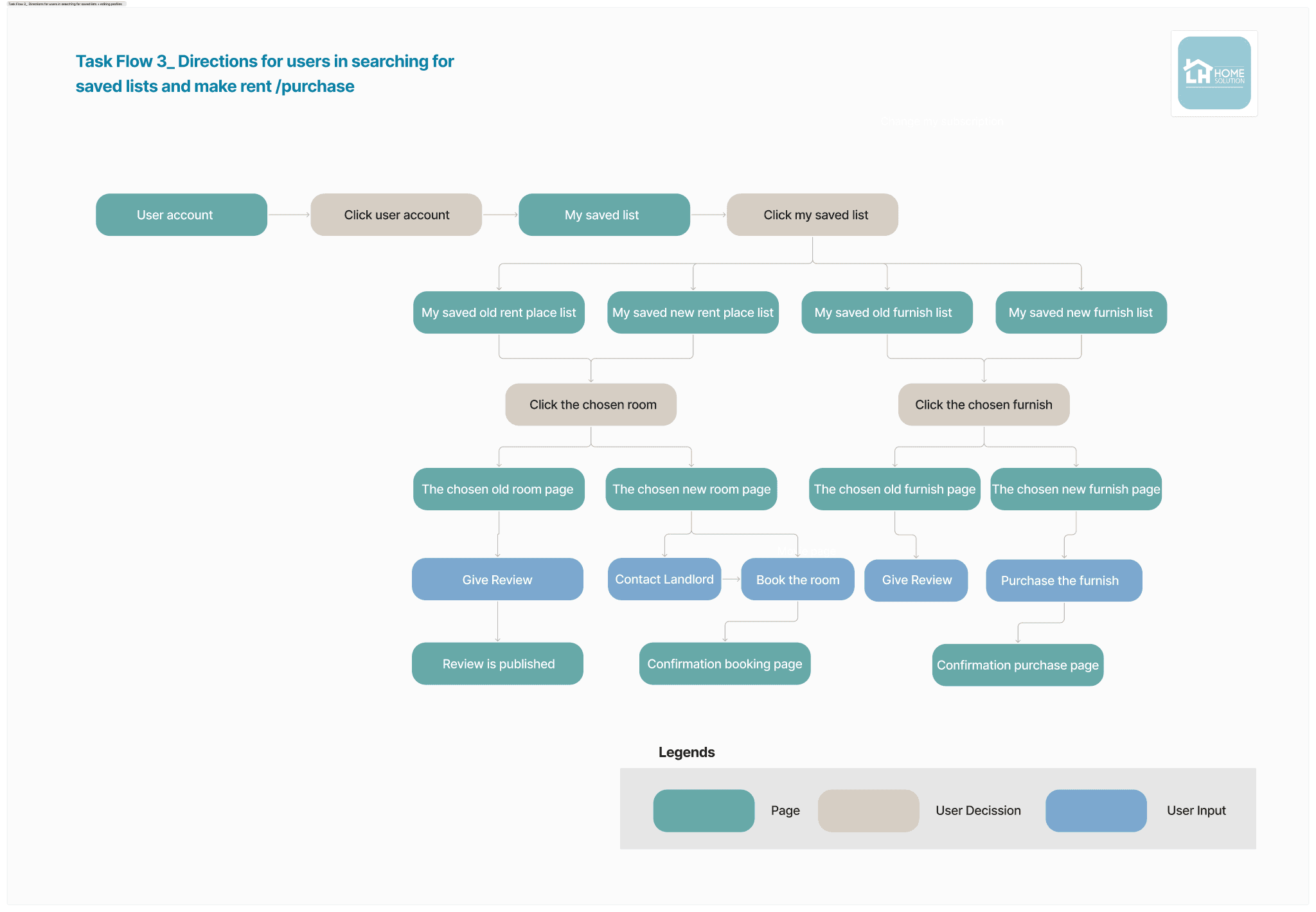
To ensure that users like Joyce and Adrian would be able to navigate the app, I drafted User Flows to illustrate their likely steps as they complete basic tasks.

Task Flow
To ensure that users like Joyce and Adrian could navigate the application, I created a Task Flow to illustrate clear and concise steps in solving their problems.

Low-Fi Wireframes

Building the Brand
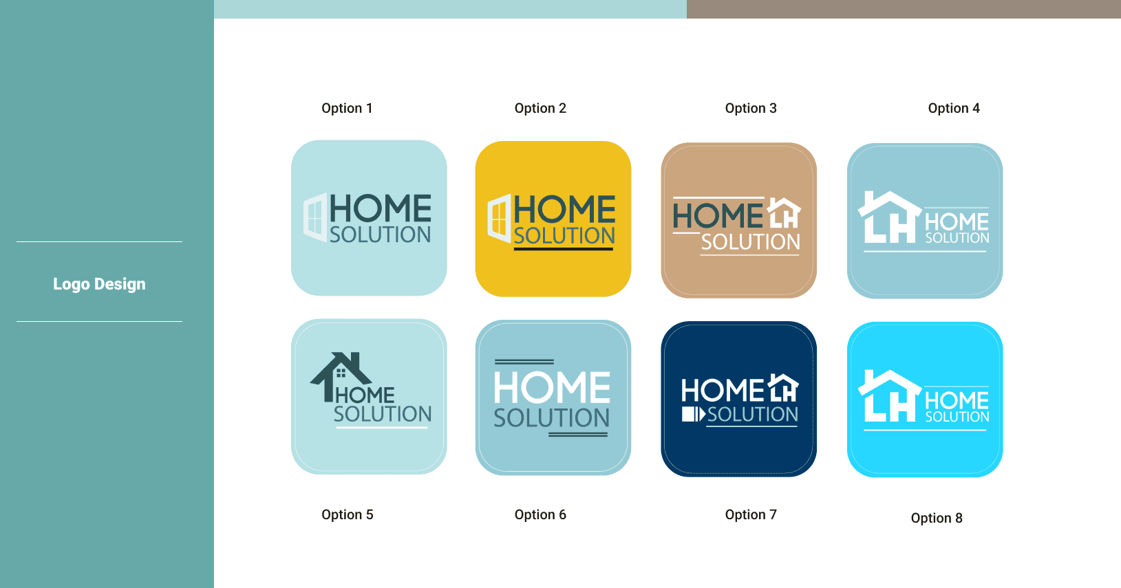
When creating this brand, I wanted to combine a clean, elegant, and fresh design style. For selecting element designs, I chose bright and soft colors to make users feel comfortable when using this application.


Putting It All Together
Mid-Fi Wireframes

Hi-Fi Wireframes


Iterations [Find Room]
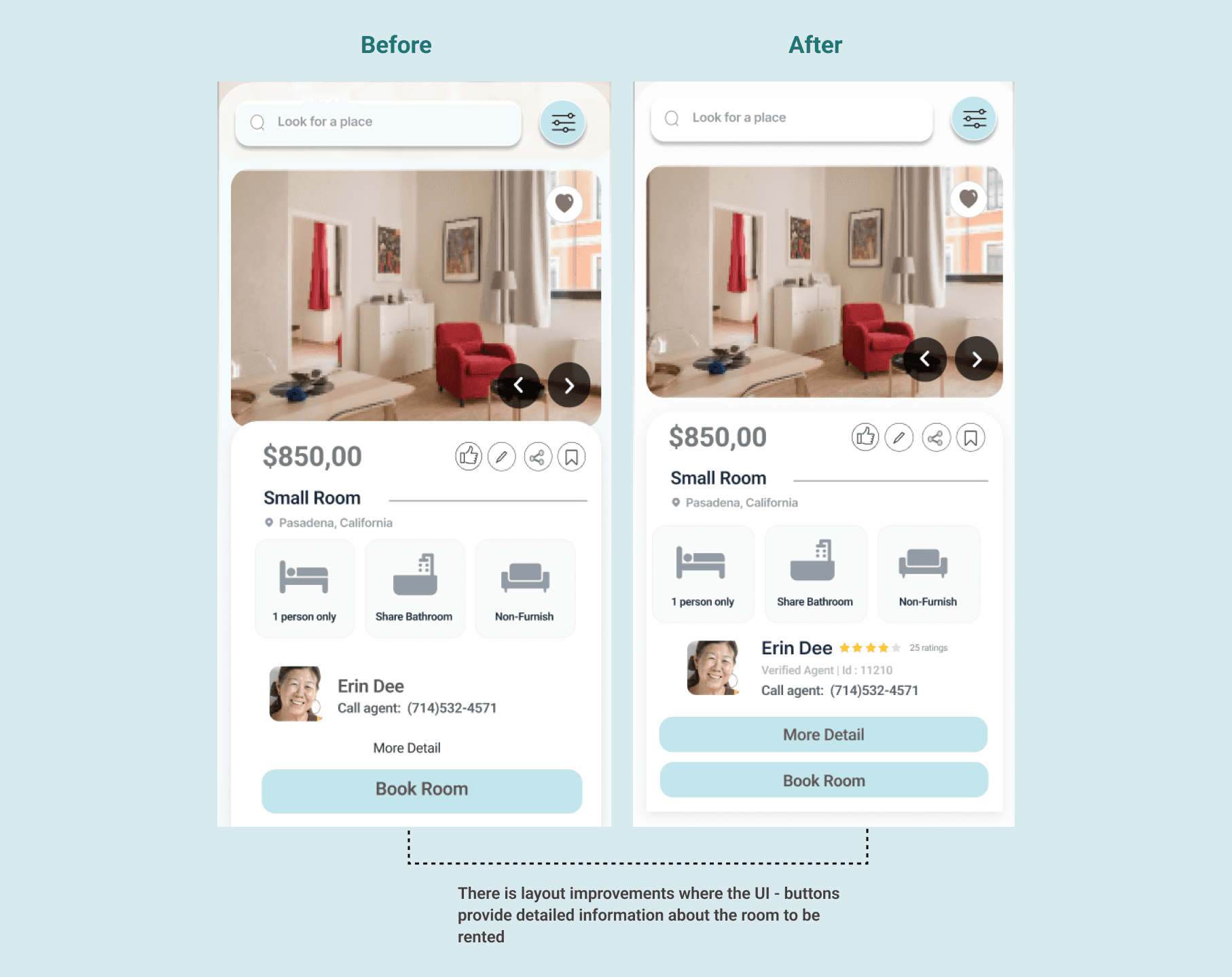
Through the first round of testing, I received input from 4 users, especially when looking for a room to rent - the detailed explanation column about the room is generally an obstacle for renters when looking for a place. Considering my goal is to make it easier for users to find a place to stay, detailed information and friendly UI Buttons will help users.
Iterations [Find Furnishings]
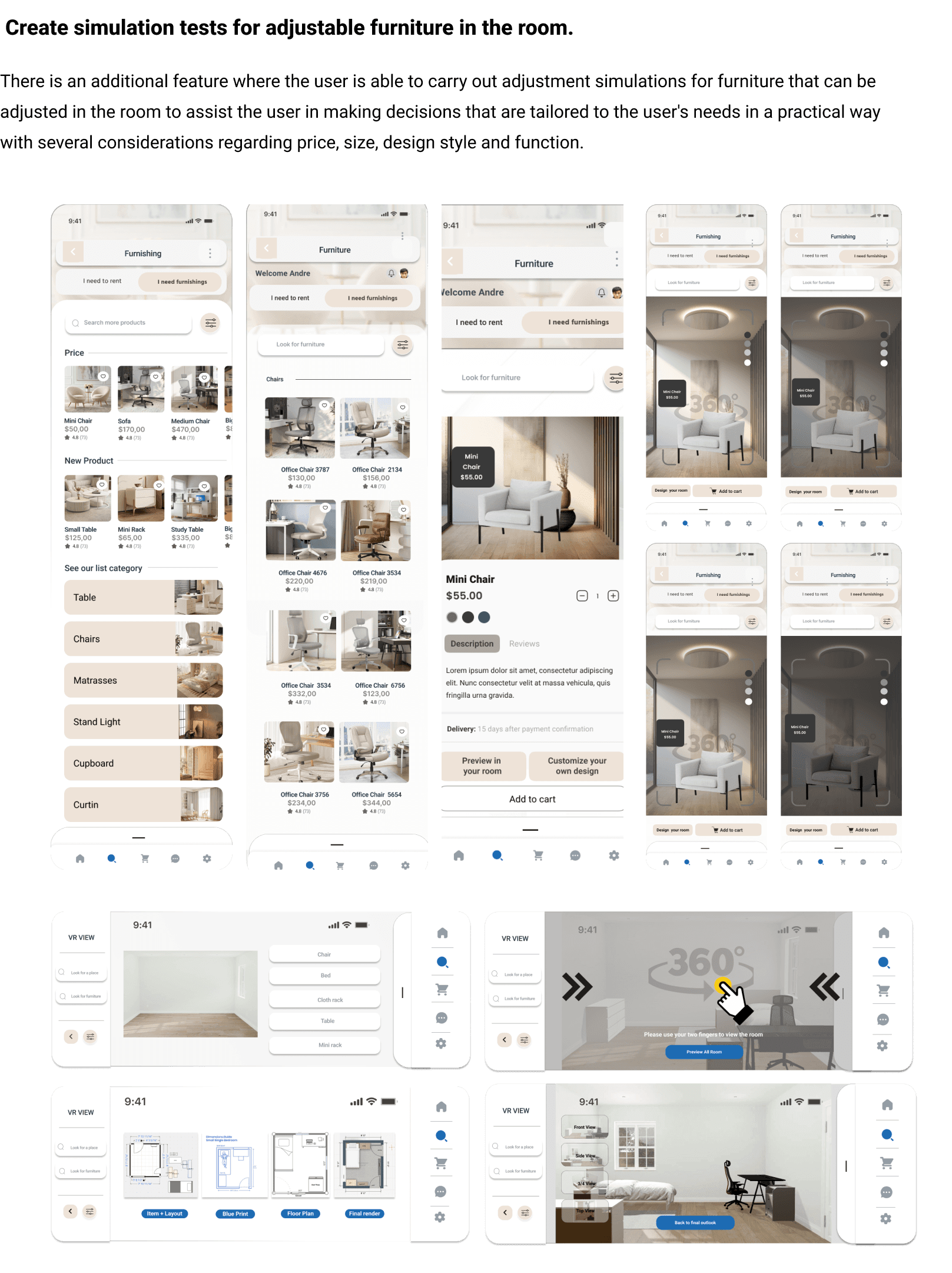
Through the first round of testing, I got input from all users, especially when looking for furnishings, in the summary items column, many users, 2 users who have families, 1 elderly woman, and 1 professional user had considerations regarding delivery options and also product installation. Having a delivery option will make user activities easier.
Only 1 young male user is not too concerned about delivery options and I see that the user is relatively young, works as a student, and has the patience to learn.

Given the visual improvements here, users appreciated the visual appeal and interest, which I adapted for my final design.
Final product
As I was transitioning from low-fi wireframes to hi-fi wireframes, I referred back to the task flows often. This taught me the importance of planning the interactions and decisions the user can take, in order to determine the key pages for the application. Since this application was designed to be a flexible management tool, there were many different approaches to how list data could be displayed, and the design I created was aimed to have a balance of flexibility and some structure. My next steps would be to conduct user testing to determine whether the flow of the application is understandable and familiar.
Find Rent
Find Furnishings
Final Thoughts
The third project was the first time I challenged myself to create a new and fresh concept, where I decided to combine 2 application functions, both searching for housing and also searching for furnishings. Making this application is connected to my experience in the past where I had experienced difficulties in finding a place to live and I saw that this was experienced by many immigrants, international students, and elderly people. This gives me the motivation to create something useful for society, especially in the increasingly expensive search for housing in the city of California. With a good information container, will help every need for users.
TAKEAWAYS
For this third project, I will focus on three things:
1. Continue to develop this application to further both its function and use.
2. Conduct usability testing with real users. I see this as very important to pay attention to, where testing must continue to be carried out and a lot of information must continue to be updated.
3. There are feature improvements that will really help users in the future, which in my opinion is the AI feature. I still want to observe what user needs are, and how users can adjust their needs through this feature.
